mirror of
https://github.com/Auties00/Reboot-Launcher.git
synced 2026-01-13 19:22:22 +01:00
184 lines
5.6 KiB
Dart
184 lines
5.6 KiB
Dart
import 'package:fluent_ui/fluent_ui.dart';
|
|
|
|
/// The default vertical padding of the scaffold page
|
|
///
|
|
/// Eyeballed from Windows 10
|
|
const double kPageDefaultVerticalPadding = 24.0;
|
|
|
|
/// Creates a page that follows fluent-ui design guidelines.
|
|
///
|
|
/// See also:
|
|
/// * [PageHeader], usually used on the [header] property
|
|
/// * [NavigationBody], the widget that implements fluent page transitions
|
|
/// into navigation view.
|
|
/// * [ScaffoldPageParent], used by [NavigationView] to tell `ScaffoldPage`
|
|
/// if a button is necessary to be displayed before [title]
|
|
class ScaffoldPage extends StatelessWidget {
|
|
/// Creates a new scaffold page.
|
|
const ScaffoldPage({
|
|
Key? key,
|
|
this.header,
|
|
this.content = const SizedBox.expand(),
|
|
this.bottomBar,
|
|
this.padding,
|
|
}) : super(key: key);
|
|
|
|
/// Creates a scrollable page
|
|
///
|
|
/// The default horizontal and vertical padding is added automatically
|
|
ScaffoldPage.scrollable({
|
|
Key? key,
|
|
this.header,
|
|
this.bottomBar,
|
|
this.padding,
|
|
ScrollController? scrollController,
|
|
required List<Widget> children,
|
|
}) : content = Builder(builder: (context) {
|
|
return ListView(
|
|
controller: scrollController,
|
|
padding: EdgeInsets.only(
|
|
bottom: kPageDefaultVerticalPadding,
|
|
left: PageHeader.horizontalPadding(context),
|
|
right: PageHeader.horizontalPadding(context),
|
|
),
|
|
children: children,
|
|
);
|
|
}),
|
|
super(key: key);
|
|
|
|
/// Creates a page with padding applied to [content]
|
|
ScaffoldPage.withPadding({
|
|
Key? key,
|
|
this.header,
|
|
this.bottomBar,
|
|
this.padding,
|
|
required Widget content,
|
|
}) : content = Builder(builder: (context) {
|
|
return Padding(
|
|
padding: EdgeInsets.only(
|
|
bottom: kPageDefaultVerticalPadding,
|
|
left: PageHeader.horizontalPadding(context),
|
|
right: PageHeader.horizontalPadding(context),
|
|
),
|
|
child: content,
|
|
);
|
|
}),
|
|
super(key: key);
|
|
|
|
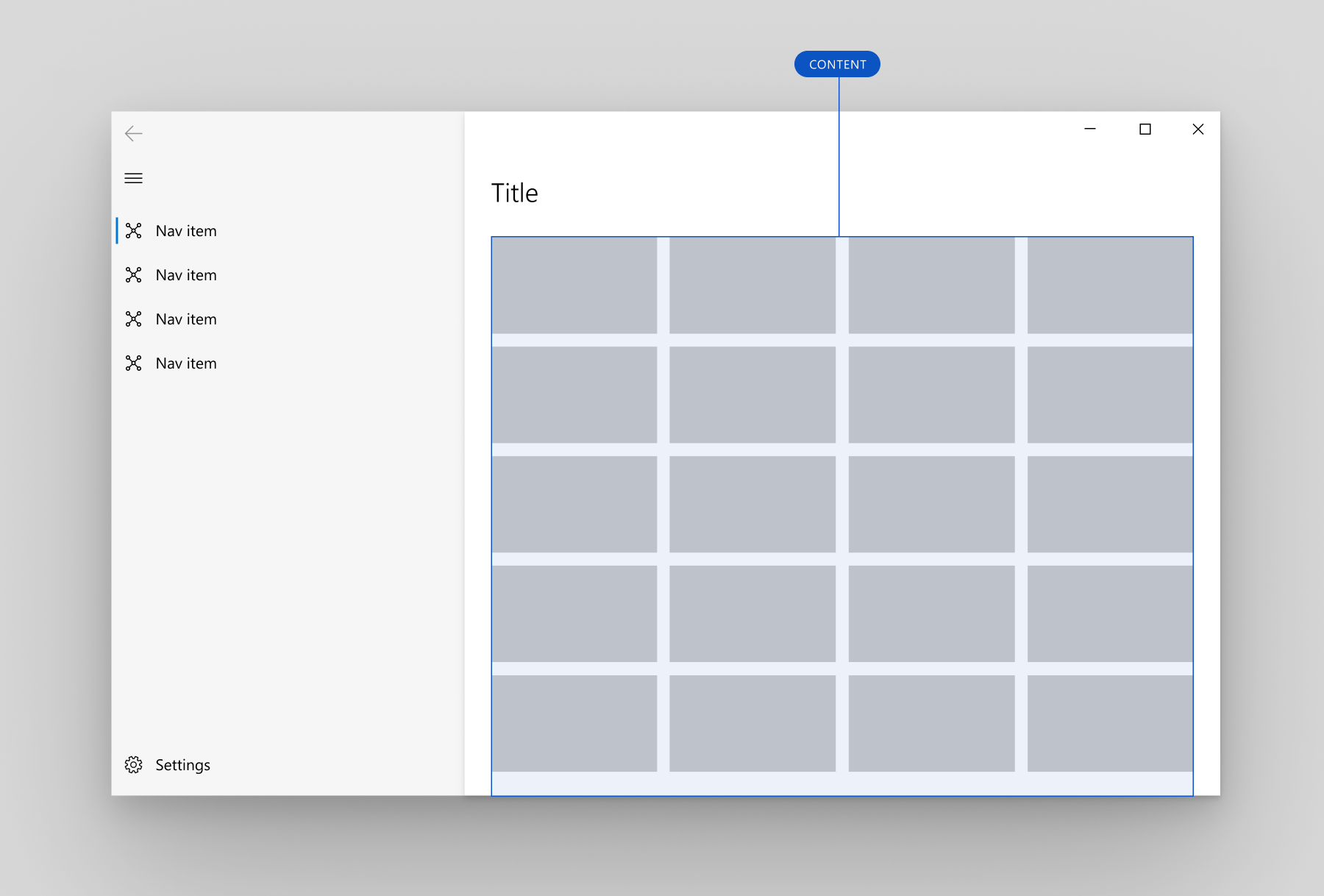
/// The content of this page. The content area is where most of the information
|
|
/// for the selected nav category is displayed.
|
|
///
|
|
/// If this widget is scrollable, you may want to provide [contentScrollController]
|
|
/// as well, to add a scrollbar to the right of the page.
|
|
///
|
|
/// 
|
|
final Widget content;
|
|
|
|
/// The header of this page. Usually a [PageHeader] is used.
|
|
///
|
|
/// 
|
|
final Widget? header;
|
|
|
|
/// The bottom bar of this page. This is usually provided when the current
|
|
/// screen is small.
|
|
///
|
|
/// Usually a [BottomNavigation]
|
|
final Widget? bottomBar;
|
|
|
|
/// The padding used by this widget.
|
|
///
|
|
/// If [contentScrollController] is not null, the scrollbar is rendered over
|
|
/// this padding
|
|
///
|
|
/// If null, [PageHeader.horizontalPadding] is used horizontally and
|
|
/// [kPageDefaultVerticalPadding] is used vertically
|
|
final EdgeInsets? padding;
|
|
|
|
@override
|
|
Widget build(BuildContext context) {
|
|
assert(debugCheckHasFluentTheme(context));
|
|
final theme = FluentTheme.of(context);
|
|
// final parentView = InheritedNavigationView.maybeOf(context);
|
|
return Column(children: [
|
|
Expanded(
|
|
child: Container(
|
|
color: theme.scaffoldBackgroundColor,
|
|
padding: EdgeInsets.only(
|
|
top: padding?.top ?? kPageDefaultVerticalPadding,
|
|
// bottom: padding?.bottom ?? kPageDefaultVerticalPadding,
|
|
),
|
|
child: Column(
|
|
crossAxisAlignment: CrossAxisAlignment.start,
|
|
children: [
|
|
if (header != null) header!,
|
|
Expanded(child: content),
|
|
],
|
|
),
|
|
),
|
|
),
|
|
if (bottomBar != null) bottomBar!,
|
|
]);
|
|
}
|
|
}
|
|
|
|
class PageHeader extends StatelessWidget {
|
|
/// Creates a page header.
|
|
const PageHeader({
|
|
Key? key,
|
|
this.leading,
|
|
this.title,
|
|
this.commandBar,
|
|
this.padding,
|
|
}) : super(key: key);
|
|
|
|
/// The widget displayed before [title]. If null, some widget
|
|
/// can be inserted here implicitly. To avoid this, set this
|
|
/// property to `SizedBox.shrink()`.
|
|
final Widget? leading;
|
|
|
|
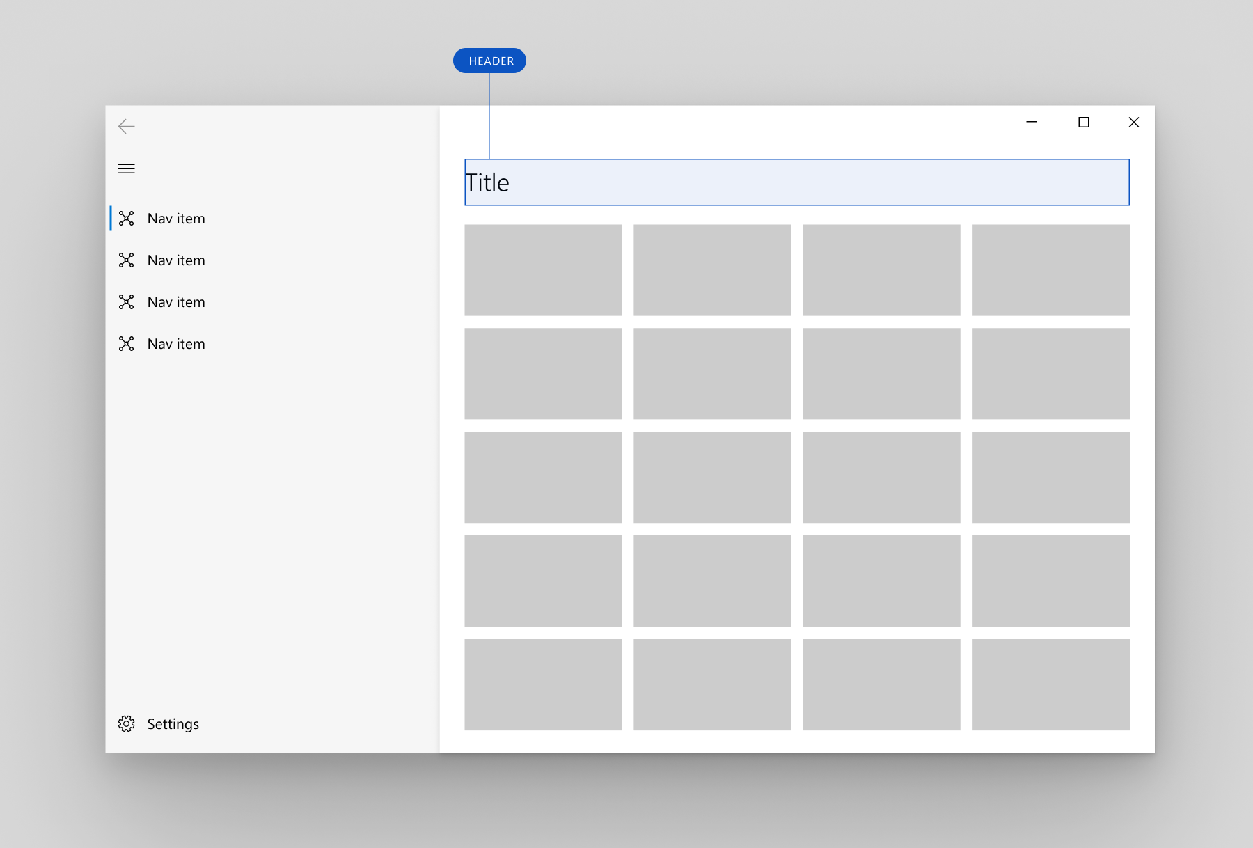
/// The title of this bar.
|
|
///
|
|
/// Usually a [Text] widget.
|
|
///
|
|
/// 
|
|
final Widget? title;
|
|
|
|
/// A bar with a list of actions an user can take
|
|
final Widget? commandBar;
|
|
|
|
final double? padding;
|
|
|
|
static double horizontalPadding(BuildContext context) {
|
|
assert(debugCheckHasMediaQuery(context));
|
|
final screenWidth = MediaQuery.of(context).size.width;
|
|
final bool isSmallScreen = screenWidth < 640.0;
|
|
final double horizontalPadding =
|
|
isSmallScreen ? 12.0 : kPageDefaultVerticalPadding;
|
|
return horizontalPadding;
|
|
}
|
|
|
|
@override
|
|
Widget build(BuildContext context) {
|
|
assert(debugCheckHasFluentTheme(context));
|
|
final leading = this.leading;
|
|
final horizontalPadding = padding ?? PageHeader.horizontalPadding(context);
|
|
return Padding(
|
|
padding: EdgeInsets.only(
|
|
bottom: 18.0,
|
|
left: leading != null ? 0 : horizontalPadding,
|
|
right: horizontalPadding,
|
|
),
|
|
child: Row(children: [
|
|
if (leading != null) leading,
|
|
Expanded(
|
|
child: DefaultTextStyle(
|
|
style: FluentTheme.of(context).typography.title!,
|
|
child: title ?? const SizedBox(),
|
|
),
|
|
),
|
|
if (commandBar != null) commandBar!,
|
|
]),
|
|
);
|
|
}
|
|
}
|