mirror of
https://github.com/Auties00/Reboot-Launcher.git
synced 2026-01-13 11:12:23 +01:00
427 lines
14 KiB
Dart
427 lines
14 KiB
Dart
import 'package:fluent_ui/fluent_ui.dart';
|
|
import 'package:flutter/foundation.dart';
|
|
import 'package:flutter/rendering.dart';
|
|
|
|
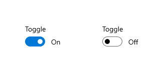
/// The toggle switch represents a physical switch that allows users to
|
|
/// turn things on or off, like a light switch. Use toggle switch controls
|
|
/// to present users with two mutually exclusive options (such as on/off),
|
|
/// where choosing an option provides immediate results.
|
|
///
|
|
/// Use a toggle switch for binary operations that take effect right after
|
|
/// the user flips the toggle switch
|
|
///
|
|
/// 
|
|
///
|
|
/// Think of the toggle switch as a physical power switch for a device: you
|
|
/// flip it on or off when you want to enable or disable the action performed
|
|
/// by the device.
|
|
///
|
|
/// See also:
|
|
/// - [Checkbox]
|
|
/// - [RadioButton]
|
|
/// - [ToggleButton]
|
|
/// - [RadioButton]
|
|
class ToggleSwitch extends StatefulWidget {
|
|
/// Creates a toggle switch.
|
|
const ToggleSwitch({
|
|
Key? key,
|
|
required this.checked,
|
|
required this.onChanged,
|
|
this.style,
|
|
this.content,
|
|
this.semanticLabel,
|
|
this.thumb,
|
|
this.focusNode,
|
|
this.autofocus = false,
|
|
this.onDisabledPress,
|
|
this.enabled = true
|
|
}) : super(key: key);
|
|
|
|
/// Whether the [ToggleSwitch] is checked
|
|
final bool checked;
|
|
|
|
/// Called when the value of the [ToggleSwitch] should change.
|
|
///
|
|
/// This callback passes a new value, but doesn't update its state
|
|
/// internally.
|
|
///
|
|
/// If this callback is null, the ToggleSwitch is disabled.
|
|
final ValueChanged<bool>? onChanged;
|
|
|
|
/// The thumb of this [ToggleSwitch]. If this is null, defaults to [DefaultToggleSwitchThumb]
|
|
final Widget? thumb;
|
|
|
|
/// The style of this [ToggleSwitch].
|
|
///
|
|
/// This style is mescled with [ThemeData.toggleSwitchThemeData]
|
|
final ToggleSwitchThemeData? style;
|
|
|
|
/// The content of the radio button.
|
|
///
|
|
/// This, if non-null, is displayed at the right of the switcher,
|
|
/// and is affected by user touch.
|
|
///
|
|
/// Usually a [Text] or [Icon] widget
|
|
final Widget? content;
|
|
|
|
/// The `semanticLabel` of this [ToggleSwitch]
|
|
final String? semanticLabel;
|
|
|
|
/// {@macro flutter.widgets.Focus.focusNode}
|
|
final FocusNode? focusNode;
|
|
|
|
/// {@macro flutter.widgets.Focus.autofocus}
|
|
final bool autofocus;
|
|
|
|
final Function()? onDisabledPress;
|
|
|
|
final bool enabled;
|
|
|
|
@override
|
|
void debugFillProperties(DiagnosticPropertiesBuilder properties) {
|
|
super.debugFillProperties(properties);
|
|
properties
|
|
..add(FlagProperty('checked', value: checked, ifFalse: 'unchecked'))
|
|
..add(ObjectFlagProperty('onChanged', onChanged, ifNull: 'disabled'))
|
|
..add(
|
|
FlagProperty('autofocus', value: autofocus, ifFalse: 'manual focus'))
|
|
..add(DiagnosticsProperty<ToggleSwitchThemeData>('style', style))
|
|
..add(StringProperty('semanticLabel', semanticLabel))
|
|
..add(ObjectFlagProperty<FocusNode>.has('focusNode', focusNode));
|
|
}
|
|
|
|
@override
|
|
_ToggleSwitchState createState() => _ToggleSwitchState();
|
|
}
|
|
|
|
class _ToggleSwitchState extends State<ToggleSwitch> {
|
|
bool _dragging = false;
|
|
|
|
Alignment? _alignment;
|
|
|
|
void _handleAlignmentChanged(
|
|
Offset localPosition, double sliderGestureWidth) {
|
|
setState(() {
|
|
_alignment = Alignment(
|
|
(localPosition.dx / sliderGestureWidth).clamp(-1, 1),
|
|
0,
|
|
);
|
|
});
|
|
}
|
|
|
|
@override
|
|
Widget build(BuildContext context) {
|
|
assert(debugCheckHasFluentTheme(context));
|
|
final ToggleSwitchThemeData style =
|
|
ToggleSwitchTheme.of(context).merge(widget.style);
|
|
final sliderGestureWidth = 45.0 + (style.padding?.horizontal ?? 0.0);
|
|
return HoverButton(
|
|
autofocus: widget.autofocus,
|
|
semanticLabel: widget.semanticLabel,
|
|
margin: style.margin,
|
|
focusNode: widget.focusNode,
|
|
onPressed: !widget.enabled ? () => widget.onDisabledPress?.call() : () => widget.onChanged!(!widget.checked),
|
|
onHorizontalDragStart: (e) {
|
|
if (!widget.enabled) {
|
|
widget.onDisabledPress?.call();
|
|
return;
|
|
}
|
|
|
|
_handleAlignmentChanged(e.localPosition, sliderGestureWidth);
|
|
setState(() => _dragging = true);
|
|
},
|
|
onHorizontalDragUpdate: (e) {
|
|
if (!widget.enabled) {
|
|
widget.onDisabledPress?.call();
|
|
return;
|
|
}
|
|
|
|
_handleAlignmentChanged(e.localPosition, sliderGestureWidth);
|
|
if (!_dragging) setState(() => _dragging = true);
|
|
},
|
|
onHorizontalDragEnd: (e) {
|
|
if (!widget.enabled) {
|
|
widget.onDisabledPress?.call();
|
|
return;
|
|
}
|
|
|
|
if (_alignment != null) {
|
|
if (_alignment!.x >= 0.5) {
|
|
widget.onChanged!(true);
|
|
} else {
|
|
widget.onChanged!(false);
|
|
}
|
|
setState(() {
|
|
_alignment = null;
|
|
_dragging = false;
|
|
});
|
|
}
|
|
},
|
|
builder: (context, states) {
|
|
Widget child = AnimatedContainer(
|
|
alignment: _alignment ??
|
|
(widget.checked ? Alignment.centerRight : Alignment.centerLeft),
|
|
height: 20,
|
|
width: 40,
|
|
duration: style.animationDuration ?? Duration.zero,
|
|
curve: style.animationCurve ?? Curves.linear,
|
|
padding: style.padding,
|
|
decoration: widget.checked
|
|
? style.checkedDecoration?.resolve(states)
|
|
: style.uncheckedDecoration?.resolve(states),
|
|
child: widget.thumb ??
|
|
DefaultToggleSwitchThumb(
|
|
checked: widget.checked,
|
|
style: style,
|
|
states: _dragging ? {ButtonStates.pressing} : states,
|
|
),
|
|
);
|
|
if (widget.content != null) {
|
|
child = Row(mainAxisSize: MainAxisSize.min, children: [
|
|
child,
|
|
const SizedBox(width: 10.0),
|
|
widget.content!,
|
|
]);
|
|
}
|
|
return Semantics(
|
|
checked: widget.checked,
|
|
child: FocusBorder(
|
|
focused: states.isFocused,
|
|
child: child,
|
|
),
|
|
);
|
|
},
|
|
);
|
|
}
|
|
}
|
|
|
|
class DefaultToggleSwitchThumb extends StatelessWidget {
|
|
const DefaultToggleSwitchThumb({
|
|
Key? key,
|
|
required this.checked,
|
|
required this.style,
|
|
required this.states,
|
|
}) : super(key: key);
|
|
|
|
final bool checked;
|
|
final ToggleSwitchThemeData? style;
|
|
final Set<ButtonStates> states;
|
|
|
|
@override
|
|
Widget build(BuildContext context) {
|
|
const checkedFactor = 1;
|
|
return AnimatedContainer(
|
|
duration: style?.animationDuration ?? Duration.zero,
|
|
curve: style?.animationCurve ?? Curves.linear,
|
|
margin: states.isHovering
|
|
? const EdgeInsets.all(1.0 + checkedFactor)
|
|
: const EdgeInsets.symmetric(
|
|
horizontal: 2.0 + checkedFactor,
|
|
vertical: 2.0 + checkedFactor,
|
|
),
|
|
height: 18,
|
|
width: 12 + (states.isHovering ? 2 : 0) + (states.isPressing ? 5 : 0),
|
|
decoration: checked
|
|
? style?.checkedThumbDecoration?.resolve(states)
|
|
: style?.uncheckedThumbDecoration?.resolve(states),
|
|
);
|
|
}
|
|
}
|
|
|
|
class ToggleSwitchTheme extends InheritedTheme {
|
|
/// Creates a button theme that controls how descendant [ToggleSwitch]es should
|
|
/// look like.
|
|
const ToggleSwitchTheme({
|
|
Key? key,
|
|
required Widget child,
|
|
required this.data,
|
|
}) : super(key: key, child: child);
|
|
|
|
final ToggleSwitchThemeData data;
|
|
|
|
/// Creates a button theme that controls how descendant [ToggleSwitch]es should
|
|
/// look like, and merges in the current button theme, if any.
|
|
static Widget merge({
|
|
Key? key,
|
|
required ToggleSwitchThemeData data,
|
|
required Widget child,
|
|
}) {
|
|
return Builder(builder: (BuildContext context) {
|
|
return ToggleSwitchTheme(
|
|
key: key,
|
|
data: _getInheritedToggleSwitchThemeData(context).merge(data),
|
|
child: child,
|
|
);
|
|
});
|
|
}
|
|
|
|
/// The data from the closest instance of this class that encloses the given
|
|
/// context.
|
|
///
|
|
/// Defaults to [ThemeData.toggleSwitchTheme]
|
|
///
|
|
/// Typical usage is as follows:
|
|
///
|
|
/// ```dart
|
|
/// ToggleSwitchThemeData theme = ToggleSwitchTheme.of(context);
|
|
/// ```
|
|
static ToggleSwitchThemeData of(BuildContext context) {
|
|
assert(debugCheckHasFluentTheme(context));
|
|
return ToggleSwitchThemeData.standard(FluentTheme.of(context)).merge(
|
|
_getInheritedToggleSwitchThemeData(context),
|
|
);
|
|
}
|
|
|
|
static ToggleSwitchThemeData _getInheritedToggleSwitchThemeData(
|
|
BuildContext context) {
|
|
final ToggleSwitchTheme? checkboxTheme =
|
|
context.dependOnInheritedWidgetOfExactType<ToggleSwitchTheme>();
|
|
return checkboxTheme?.data ?? FluentTheme.of(context).toggleSwitchTheme;
|
|
}
|
|
|
|
@override
|
|
Widget wrap(BuildContext context, Widget child) {
|
|
return ToggleSwitchTheme(data: data, child: child);
|
|
}
|
|
|
|
@override
|
|
bool updateShouldNotify(ToggleSwitchTheme oldWidget) {
|
|
return oldWidget.data != data;
|
|
}
|
|
}
|
|
|
|
@immutable
|
|
class ToggleSwitchThemeData with Diagnosticable {
|
|
final ButtonState<Decoration?>? checkedThumbDecoration;
|
|
final ButtonState<Decoration?>? uncheckedThumbDecoration;
|
|
|
|
final ButtonState<Decoration?>? checkedDecoration;
|
|
final ButtonState<Decoration?>? uncheckedDecoration;
|
|
|
|
final EdgeInsetsGeometry? padding;
|
|
final EdgeInsetsGeometry? margin;
|
|
|
|
final Duration? animationDuration;
|
|
final Curve? animationCurve;
|
|
|
|
const ToggleSwitchThemeData({
|
|
this.padding,
|
|
this.margin,
|
|
this.animationDuration,
|
|
this.animationCurve,
|
|
this.checkedThumbDecoration,
|
|
this.uncheckedThumbDecoration,
|
|
this.checkedDecoration,
|
|
this.uncheckedDecoration,
|
|
});
|
|
|
|
factory ToggleSwitchThemeData.standard(ThemeData style) {
|
|
final defaultThumbDecoration = BoxDecoration(
|
|
borderRadius: BorderRadius.circular(100),
|
|
);
|
|
|
|
final defaultDecoration = BoxDecoration(
|
|
borderRadius: BorderRadius.circular(100),
|
|
);
|
|
|
|
return ToggleSwitchThemeData(
|
|
checkedDecoration: ButtonState.resolveWith((states) {
|
|
return defaultDecoration.copyWith(
|
|
color: ButtonThemeData.checkedInputColor(style, states),
|
|
border: Border.all(
|
|
width: 1,
|
|
color: Colors.transparent,
|
|
),
|
|
);
|
|
}),
|
|
uncheckedDecoration: ButtonState.resolveWith((states) {
|
|
return defaultDecoration.copyWith(
|
|
color: ButtonThemeData.uncheckedInputColor(style, states),
|
|
border: Border.all(
|
|
width: 1,
|
|
color: style.borderInputColor
|
|
),
|
|
);
|
|
}),
|
|
margin: const EdgeInsets.all(4),
|
|
animationDuration: style.fastAnimationDuration,
|
|
animationCurve: style.animationCurve,
|
|
checkedThumbDecoration: ButtonState.resolveWith((states) {
|
|
return defaultThumbDecoration.copyWith(
|
|
color: style.checkedColor
|
|
);
|
|
}),
|
|
uncheckedThumbDecoration: ButtonState.resolveWith((states) {
|
|
return defaultThumbDecoration.copyWith(
|
|
color: style.uncheckedColor
|
|
);
|
|
}),
|
|
);
|
|
}
|
|
|
|
static ToggleSwitchThemeData lerp(
|
|
ToggleSwitchThemeData? a,
|
|
ToggleSwitchThemeData? b,
|
|
double t,
|
|
) {
|
|
return ToggleSwitchThemeData(
|
|
margin: EdgeInsetsGeometry.lerp(a?.margin, b?.margin, t),
|
|
padding: EdgeInsetsGeometry.lerp(a?.padding, b?.padding, t),
|
|
animationCurve: t < 0.5 ? a?.animationCurve : b?.animationCurve,
|
|
animationDuration: lerpDuration(a?.animationDuration ?? Duration.zero,
|
|
b?.animationDuration ?? Duration.zero, t),
|
|
checkedThumbDecoration: ButtonState.lerp(a?.checkedThumbDecoration,
|
|
b?.checkedThumbDecoration, t, Decoration.lerp),
|
|
uncheckedThumbDecoration: ButtonState.lerp(a?.uncheckedThumbDecoration,
|
|
b?.uncheckedThumbDecoration, t, Decoration.lerp),
|
|
checkedDecoration: ButtonState.lerp(
|
|
a?.checkedDecoration, b?.checkedDecoration, t, Decoration.lerp),
|
|
uncheckedDecoration: ButtonState.lerp(
|
|
a?.uncheckedDecoration, b?.uncheckedDecoration, t, Decoration.lerp),
|
|
);
|
|
}
|
|
|
|
ToggleSwitchThemeData merge(ToggleSwitchThemeData? style) {
|
|
return ToggleSwitchThemeData(
|
|
margin: style?.margin ?? margin,
|
|
padding: style?.padding ?? padding,
|
|
animationCurve: style?.animationCurve ?? animationCurve,
|
|
animationDuration: style?.animationDuration ?? animationDuration,
|
|
checkedThumbDecoration:
|
|
style?.checkedThumbDecoration ?? checkedThumbDecoration,
|
|
uncheckedThumbDecoration:
|
|
style?.uncheckedThumbDecoration ?? uncheckedThumbDecoration,
|
|
checkedDecoration: style?.checkedDecoration ?? checkedDecoration,
|
|
uncheckedDecoration: style?.uncheckedDecoration ?? uncheckedDecoration,
|
|
);
|
|
}
|
|
|
|
@override
|
|
void debugFillProperties(DiagnosticPropertiesBuilder properties) {
|
|
super.debugFillProperties(properties);
|
|
properties.add(DiagnosticsProperty<EdgeInsetsGeometry?>('margin', margin));
|
|
properties
|
|
.add(DiagnosticsProperty<EdgeInsetsGeometry?>('padding', padding));
|
|
properties
|
|
.add(DiagnosticsProperty<Curve?>('animationCurve', animationCurve));
|
|
properties.add(
|
|
DiagnosticsProperty<Duration?>('animationDuration', animationDuration));
|
|
properties.add(ObjectFlagProperty<ButtonState<Decoration?>?>.has(
|
|
'checkedDecoration',
|
|
checkedDecoration,
|
|
));
|
|
properties.add(ObjectFlagProperty<ButtonState<Decoration?>?>.has(
|
|
'uncheckedDecoration',
|
|
uncheckedDecoration,
|
|
));
|
|
properties.add(ObjectFlagProperty<ButtonState<Decoration?>?>.has(
|
|
'checkedThumbDecoration',
|
|
checkedThumbDecoration,
|
|
));
|
|
properties.add(ObjectFlagProperty<ButtonState<Decoration?>?>.has(
|
|
'uncheckedThumbDecoration',
|
|
uncheckedThumbDecoration,
|
|
));
|
|
}
|
|
}
|