mirror of
https://github.com/Auties00/Reboot-Launcher.git
synced 2026-01-14 03:32:23 +01:00
1808 lines
68 KiB
Markdown
1808 lines
68 KiB
Markdown
<div>
|
||
<h1 align="center">fluent_ui</h1>
|
||
<p align="center" >
|
||
<a title="Discord" href="https://discord.gg/674gpDQUVq">
|
||
<img src="https://img.shields.io/discord/809528329337962516?label=discord&logo=discord" />
|
||
</a>
|
||
<a title="Pub" href="https://pub.dartlang.org/packages/fluent_ui" >
|
||
<img src="https://img.shields.io/pub/v/fluent_ui.svg?style=popout&include_prereleases" />
|
||
</a>
|
||
<a title="Made with Fluent Design" href="https://github.com/bdlukaa/fluent_ui">
|
||
<img src="https://img.shields.io/badge/fluent-design-blue?style=flat-square&color=7A7574&labelColor=0078D7">
|
||
</a>
|
||
<a title="Github License">
|
||
<img src="https://img.shields.io/github/license/bdlukaa/fluent_ui" />
|
||
</a>
|
||
</p>
|
||
<p align="center">
|
||
Design beautiful native windows apps using Flutter
|
||
</p>
|
||
</div>
|
||
|
||
Unofficial implementation of Fluent UI for [Flutter](flutter.dev). It's written based on the [official documentation](https://docs.microsoft.com/en-us/windows/uwp/design/)
|
||
|
||
### You can check the web version of it [here](https://bdlukaa.github.io/fluent_ui/)
|
||
|
||

|
||
|
||
### Content
|
||
|
||
- [Motivation](#motivation)
|
||
- [Sponsors](#sponsors)
|
||
- [Installation](#installation)
|
||
- [Badge](#badge)
|
||
- [Style](#style)
|
||
- [Icons](#icons)
|
||
- [Colors](#colors)
|
||
- [Accent color](#accent-color)
|
||
- [Brightness](#brightness)
|
||
- [Visual Density](#visual-density)
|
||
- [Typograpy](#typography)
|
||
- [Font](#font)
|
||
- [Type ramp](#type-ramp)
|
||
- [Reveal Focus](#reveal-focus)
|
||
- [Motion](#motion)
|
||
- [Page Transitions](#page-transitions)
|
||
- [Navigation](#navigation)
|
||
- [Navigation View](#navigation-view)
|
||
- [App Bar](#app-bar)
|
||
- [Navigation Pane](#navigation-pane)
|
||
- [Navigation Body](#navigation-body)
|
||
- [Info Badge](#info-badge)
|
||
- [Tab View](#tab-view)
|
||
- [Bottom Navigation](#bottom-navigation)
|
||
- [Inputs](#inputs)
|
||
- [Button](#button)
|
||
- [Filled Button](#filled-button)
|
||
- [Icon Button](#icon-button)
|
||
- [Outlined Button](#outlined-button)
|
||
- [Text Button](#outlined-button)
|
||
- [Split Button](#split-button)
|
||
- [Toggle Button](#toggle-button)
|
||
- [Checkbox](#checkbox)
|
||
- [Toggle Switch](#toggle-switch)
|
||
- [Radio Buttons](#radio-buttons)
|
||
- [DropDown Button](#dropdown-button)
|
||
- [Slider](#slider)
|
||
- [Choosing between vertical and horizontal sliders](#choosing-between-vertical-and-horizontal-sliders)
|
||
- [Forms](#forms)
|
||
- [TextBox](#textbox)
|
||
- [Auto Suggest Box](#auto-suggest-box)
|
||
- [Combo Box](#combo-box)
|
||
- [Widgets](#widgets)
|
||
- [Tooltip](#tooltip)
|
||
- [Content Dialog](#content-dialog)
|
||
- [Expander](#expander)
|
||
- [Flyout](#flyout)
|
||
- **TODO** [Teaching tip]()
|
||
- [Acrylic](#acrylic)
|
||
- [InfoBar](#infobar)
|
||
- **TODO** [Calendar View](#calendar-view)
|
||
- **TODO** [Calendar Date Picker]()
|
||
- [Date Picker](#date-picker)
|
||
- [Time Picker](#time-picker)
|
||
- [Progress Bar and Progress Ring](#progress-bar-and-progress-ring)
|
||
- [Scrollbar](#scrollbar)
|
||
- [List Tile](#list-tile)
|
||
- [Info Label](#info-label)
|
||
- [TreeView](#treeview)
|
||
- [Scrollable tree view](#scrollable-tree-view)
|
||
- [Lazily load nodes](#lazily-load-nodes)
|
||
- [CommandBar](#commandbar)
|
||
- [Mobile Widgets](#mobile-widgets)
|
||
- [Chip](#chip)
|
||
- [Pill Button Bar](#pill-button-bar)
|
||
- [Snackbar](#snackbar)
|
||
- [Layout Widgets](#layout-widgets)
|
||
- [DynamicOverflow](#dynamicoverflow)
|
||
- [Equivalents with the material library](#equivalents-with-the-material-library)
|
||
- [Localization](#Localization)
|
||
- [Contribution](#contribution)
|
||
- [Contributing new localizations](#contributing-new-localizations)
|
||
- [Acknowledgements](#acknowledgements)
|
||
|
||
## Motivation
|
||
|
||
Since Flutter has stable Windows support, it's necessary to have support to its UI guidelines to build apps with fidelity, the same way it has support for Material and Cupertino.
|
||
See [this](https://github.com/flutter/flutter/issues/46481) for more info on the offical fluent ui support
|
||
|
||
See also:
|
||
|
||
- [Material UI for Flutter](https://flutter.dev/docs/development/ui/widgets/material)
|
||
- [Cupertino UI for Flutter](https://flutter.dev/docs/development/ui/widgets/cupertino)
|
||
- [MacOS UI for Flutter](https://github.com/GroovinChip/macos_ui)
|
||
|
||
## Sponsors
|
||
|
||
Want to be a sponsor? Become one [here](https://patreon.com/bdlukaa)
|
||
|
||
These are our really cool sponsors!
|
||
|
||
<a href="https://github.com/phorcys420"><img src="https://github.com/phorcys420.png" width="50px" alt="phorcys420" /></a>
|
||
|
||
## Installation
|
||
|
||
Add the package to your dependencies:
|
||
|
||
```yaml
|
||
dependencies:
|
||
fluent_ui: ^3.10.0
|
||
```
|
||
|
||
OR:
|
||
|
||
```yaml
|
||
dependencies:
|
||
fluent_ui:
|
||
git: https://github.com/bdlukaa/fluent_ui.git
|
||
```
|
||
|
||
You can see the example app [here](https://bdlukaa.github.io/fluent_ui//)
|
||
|
||
Finally, run `dart pub get` to download the package.
|
||
|
||
Projects using this library should use the stable channel of Flutter
|
||
|
||
### Badge
|
||
|
||
Are you using this library on your app? You can use a badge to tell others:
|
||
|
||
<a title="Made with Fluent Design" href="https://github.com/bdlukaa/fluent_ui">
|
||
<img src="https://img.shields.io/badge/fluent-design-blue?style=flat-square&color=7A7574&labelColor=0078D7">
|
||
</a>
|
||
|
||
Add the following code to your `README.md` or to your website:
|
||
|
||
```html
|
||
<a title="Made with Fluent Design" href="https://github.com/bdlukaa/fluent_ui">
|
||
<img
|
||
src="https://img.shields.io/badge/fluent-design-blue?style=flat-square&color=7A7574&labelColor=0078D7"
|
||
/>
|
||
</a>
|
||
```
|
||
|
||
---
|
||
|
||
# Style
|
||
|
||
[Learn more about Fluent Style](https://docs.microsoft.com/en-us/windows/uwp/design/style/)
|
||
|
||
You can use the `FluentTheme` widget to, well... theme your widgets. You can style your widgets in two ways:
|
||
|
||
1. Using the `FluentApp` widget
|
||
|
||
```dart
|
||
FluentApp(
|
||
title: 'MyApp',
|
||
theme: ThemeData(
|
||
...
|
||
),
|
||
)
|
||
```
|
||
|
||
2. Using the `FluentTheme` widget
|
||
|
||
```dart
|
||
FluentTheme(
|
||
theme: ThemeData(
|
||
...
|
||
),
|
||
child: ...,
|
||
),
|
||
```
|
||
|
||
## Icons
|
||
|
||

|
||
|
||
Inside your app, you use icons to represent an action, such as copying text or navigating to the settings page. This library includes an icon library with it, so you can just call `FluentIcons.[icon_name]` in any `Icon` widget:
|
||
|
||
```dart
|
||
Icon(FluentIcons.add),
|
||
```
|
||
|
||
For a complete reference of current icons, please check the [online demo](https://bdlukaa.github.io/fluent_ui/) and click on "Icons".
|
||
|
||
The online demo has a search box and also supports clipboard copy in order to find every icon as fast as possible.
|
||
|
||
|
||
|
||
## Colors
|
||
|
||
This library also includes the Fluent UI colors with it, so you can just call `Colors.[color_name]`:
|
||
|
||
```dart
|
||
TextStyle(color: Colors.black),
|
||
```
|
||
|
||
Avaiable colors:
|
||
|
||
- `Colors.transparent`
|
||
- `Colors.white`
|
||
- `Colors.black`
|
||
- `Colors.grey`
|
||
- `Colors.yellow`
|
||
- `Colors.orange`
|
||
- `Colors.red`
|
||
- `Colors.magenta`
|
||
- `Colors.purple`
|
||
- `Colors.blue`
|
||
- `Colors.teal`
|
||
- `Colors.green`
|
||
|
||
### Accent color
|
||
|
||
Common controls use an accent color to convey state information. [Learn more](https://docs.microsoft.com/en-us/windows/uwp/design/style/color#accent-color).
|
||
|
||
By default, the accent color is `Colors.blue`. However, you can also customize your app's accent color to reflect your brand:
|
||
|
||
```dart
|
||
ThemeData(
|
||
accentColor: Colors.blue,
|
||
)
|
||
```
|
||
|
||
To use the system's accent color, you can use the plugin [system_theme](https://pub.dev/packages/system_theme) made by me :). It has support for (as of 04/01/2021) Android, Web and Windows.
|
||
|
||
```dart
|
||
import 'package:system_theme/system_theme.dart';
|
||
|
||
ThemeData(
|
||
accentColor: SystemTheme.accentInstance.accent.toAccentColor(),
|
||
)
|
||
```
|
||
|
||
## Brightness
|
||
|
||
You can change the theme brightness to change the color of your app to
|
||
|
||
1. `Brightness.light`
|
||
|
||

|
||
|
||
2. `Brightness.dark`
|
||
|
||

|
||
|
||
It defaults to the brightness of the device. (`MediaQuery.of(context).platformBrightness`)
|
||
|
||
```dart
|
||
ThemeData(
|
||
brightness: Brightness.light, // or Brightness.dark
|
||
),
|
||
```
|
||
|
||
## Visual Density
|
||
|
||
Density, in the context of a UI, is the vertical and horizontal "compactness" of the components in the UI. It is unitless, since it means different things to different UI components.
|
||
|
||
The default for visual densities is zero for both vertical and horizontal densities. It does not affect text sizes, icon sizes, or padding values.
|
||
|
||
For example, for buttons, it affects the spacing around the child of the button. For lists, it affects the distance between baselines of entries in the list. For chips, it only affects the vertical size, not the horizontal size.
|
||
|
||
```dart
|
||
ThemeData(
|
||
visualDensity: VisualDensity.adaptivePlatformDensity,
|
||
),
|
||
```
|
||
|
||
The following widgets make use of visual density:
|
||
|
||
- Chip
|
||
- PillButtonBar
|
||
- Snackbar
|
||
|
||
## Typography
|
||
|
||
To set a typography, you can use the `ThemeData` class combined with the `Typography` class:
|
||
|
||
```dart
|
||
ThemeData(
|
||
typography: Typography(
|
||
caption: TextStyle(
|
||
fontSize: 12,
|
||
color: Colors.black,
|
||
fontWeight: FontWeight.normal,
|
||
),
|
||
),
|
||
)
|
||
```
|
||
|
||
### Font
|
||
|
||
You should use one font throughout your app's UI, and we recommend sticking with the default font for Windows apps, **Segoe UI Variable**. It's designed to maintain optimal legibility across sizes and pixel densities and offers a clean, light, and open aesthetic that complements the content of the system. [Learn more](https://docs.microsoft.com/en-us/windows/apps/design/style/typography#font)
|
||
|
||

|
||
|
||
|
||
### Type ramp
|
||
|
||
The Windows type ramp establishes crucial relationships between the type styles on a page, helping users read content easily. All sizes are in effective pixels. [Learn more](https://docs.microsoft.com/en-us/windows/apps/design/style/typography#type-ramp)
|
||
|
||

|
||
|
||
## Reveal Focus
|
||
|
||
Reveal Focus is a lighting effect for [10-foot experiences](https://docs.microsoft.com/en-us/windows/uwp/design/devices/designing-for-tv), such as Xbox One and television screens. It animates the border of focusable elements, such as buttons, when the user moves gamepad or keyboard focus to them. It's turned off by default, but it's simple to enable. [Learn more](https://docs.microsoft.com/en-us/windows/uwp/design/style/reveal-focus)
|
||
|
||
Reveal Focus calls attention to focused elements by adding an animated glow around the element's border:
|
||
|
||
|
||
|
||
This is especially helpful in 10-foot scenarios where the user might not be paying full attention to the entire TV screen.
|
||
|
||
### Enabling it
|
||
|
||
Reveal Focus is off by default. To enable it, change the `focusTheme` in your app `ThemeData`:
|
||
|
||
```dart
|
||
theme: ThemeData(
|
||
focusTheme: FocusThemeData(
|
||
glowFactor: 4.0,
|
||
),
|
||
),
|
||
```
|
||
|
||
To enable it in a 10 foot screen, use the method `is10footScreen`:
|
||
|
||
```dart
|
||
import 'dart:ui' as ui;
|
||
|
||
theme: ThemeData(
|
||
focusTheme: FocusThemeData(
|
||
glowFactor: is10footScreen(ui.window.physicalSize.width) ? 2.0 : 0.0,
|
||
),
|
||
),
|
||
```
|
||
|
||
Go to the [example](/example) project to a full example
|
||
|
||
### Why isn't Reveal Focus on by default?
|
||
|
||
As you can see, it's fairly easy to turn on Reveal Focus when the app detects it's running on 10 foot screen. So, why doesn't the system just turn it on for you? Because Reveal Focus increases the size of the focus visual, which might cause issues with your UI layout. In some cases, you'll want to customize the Reveal Focus effect to optimize it for your app.
|
||
|
||
### Customizing Reveal Focus
|
||
|
||
You can customize the focus border, border radius and glow color:
|
||
|
||
```dart
|
||
focusTheme: FocusStyle(
|
||
borderRadius: BorderRadius.zero,
|
||
glowColor: theme.accentColor?.withOpacity(0.2),
|
||
glowFactor: 0.0,
|
||
border: BorderSide(
|
||
width: 2.0,
|
||
color: theme.inactiveColor ?? Colors.transparent,
|
||
),
|
||
),
|
||
```
|
||
|
||
To customize it to a single widget, wrap the widget in a `FocusTheme` widget, and change the options you want:
|
||
|
||
```dart
|
||
FocusTheme(
|
||
data: FocusThemeData(...),
|
||
child: Button(
|
||
text: Text('Custom Focus Button'),
|
||
onPressed: () {},
|
||
)
|
||
),
|
||
```
|
||
|
||
# Motion
|
||
|
||
This package widely uses animation in the widgets. The animation duration and curve can be defined on the app theme.
|
||
|
||
## Page transitions
|
||
|
||
Page transitions navigate users between pages in an app, providing feedback as the relationship between pages. Page transitions help users understand if they are at the top of a navigation hierarchy, moving between sibling pages, or navigating deeper into the page hierarchy.
|
||
|
||
It's recommended to widely use page transitions on `NavigationView`, that can be implemented using the widget `NavigationBody`.
|
||
|
||
This library gives you the following implementations to navigate between your pages:
|
||
|
||
#### Entrance
|
||
|
||
Entrance is a combination of a slide up animation and a fade in animation for the incoming content. Use entrance when the user is taken to the top of a navigational stack, such as navigating between tabs or left-nav items.
|
||
|
||
The desired feeling is that the user has started over.
|
||
|
||
Avaiable with the widget `EntrancePageTransition`, it produces the following effect:
|
||
|
||
|
||
|
||
#### Drill In
|
||
|
||
Use drill when users navigate deeper into an app, such as displaying more information after selecting an item.
|
||
|
||
The desired feeling is that the user has gone deeper into the app.
|
||
|
||
Avaiable with the widget `DrillInPageTransition`, it produces the following effect:
|
||
|
||
|
||
|
||
#### Horizontal
|
||
|
||
It's avaiable with the widget `HorizontalSlidePageTransition`.
|
||
|
||
# Navigation
|
||
|
||
The default Flutter Navigation is available on the `FluentApp` widget, that means you can simply call `Navigator.push` and `Navigator.pop` to navigate between routes. See [navigate to a new screen and back](https://flutter.dev/docs/cookbook/navigation/navigation-basics)
|
||
|
||
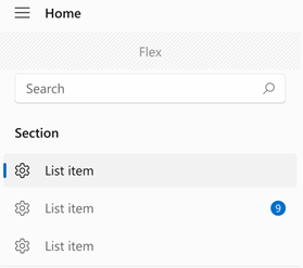
## Navigation View
|
||
|
||
The NavigationView control provides top-level navigation for your app. It adapts to a variety of screen sizes and supports both _top_ and _left_ navigation styles.
|
||
|
||
|
||
|
||
### App Bar
|
||
|
||
The app bar is the top app bar that every desktop nowadays have.
|
||
|
||
```dart
|
||
NavigationView(
|
||
appBar: NavigationAppBar(
|
||
title: Text('Nice App Title :)'),
|
||
actions: Row(children: [
|
||
/// These actions are usually the minimize, maximize and close window
|
||
]),
|
||
/// If automaticallyImplyLeading is true, a 'back button' will be added to
|
||
/// app bar. This property can be overritten by [leading]
|
||
automaticallyImplyLeading: true,
|
||
),
|
||
...
|
||
)
|
||
```
|
||
|
||
### Navigation Pane
|
||
|
||
The pane is the pane that can be displayed at the left or at the top.
|
||
|
||
```dart
|
||
NavigationView(
|
||
...,
|
||
pane: NavigationPane(
|
||
/// The current selected index
|
||
selected: index,
|
||
/// Called whenever the current index changes
|
||
onChanged: (i) => setState(() => index = i),
|
||
displayMode: PaneDisplayMode.auto,
|
||
),
|
||
...
|
||
)
|
||
```
|
||
|
||
You can change the `displayMode` to make it fit the screen.
|
||
|
||
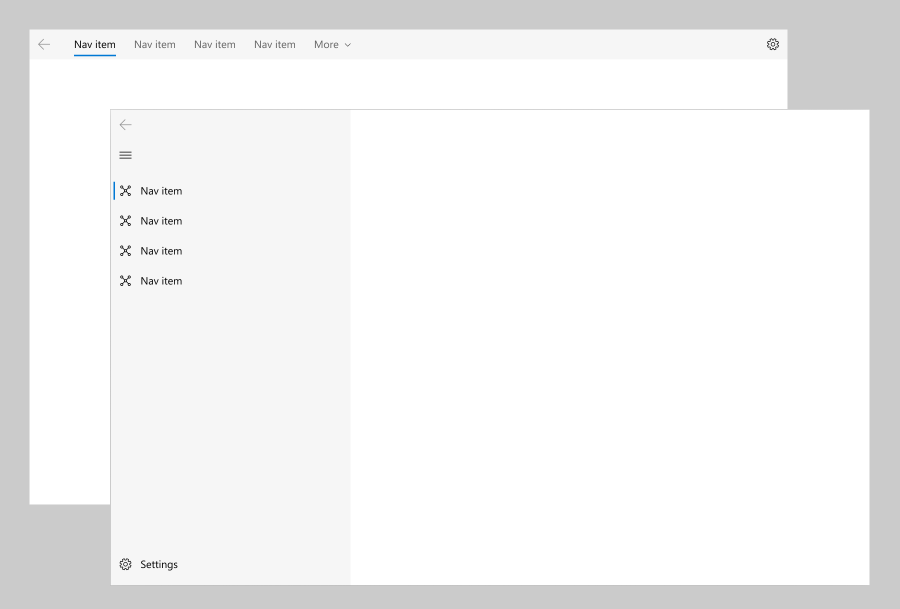
| Name | Screenshot | Info |
|
||
| ------- | ----------------------------------------------------------------------------------------------------------------- | ------------------------------------------------------------------------------------------------------------------------------------------------------------------------------------------------------------------------------------------------------------------------------------------------------------------------------------------------------------------------------------------------------------------------------------------------------------------------------ |
|
||
| Top | 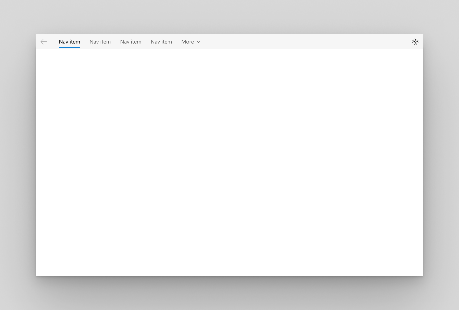 | The pane is positioned above the content. We recommend top navigation when: <br>- You have 5 or fewer top-level navigation categories that are equally important, and any additional top-level navigation categories that end up in the dropdown overflow menu are considered less important.</br> - You need to show all navigation options on screen. - You want more space for your app content. <br>- Icons cannot clearly describe your app's navigation categories.</br> |
|
||
| Open | 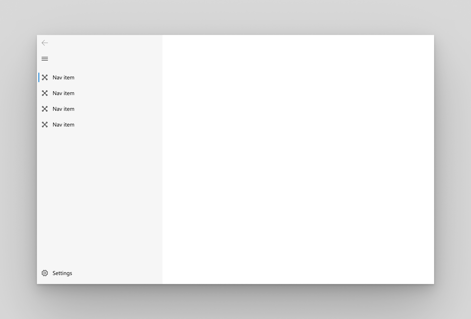 | The pane is expanded and positioned to the left of the content. We recommend _open_ navigation when: <br>- You have 5-10 equally important top-level navigation categories.</br>- You want navigation categories to be very prominent, with less space for other app content. |
|
||
| Compact | 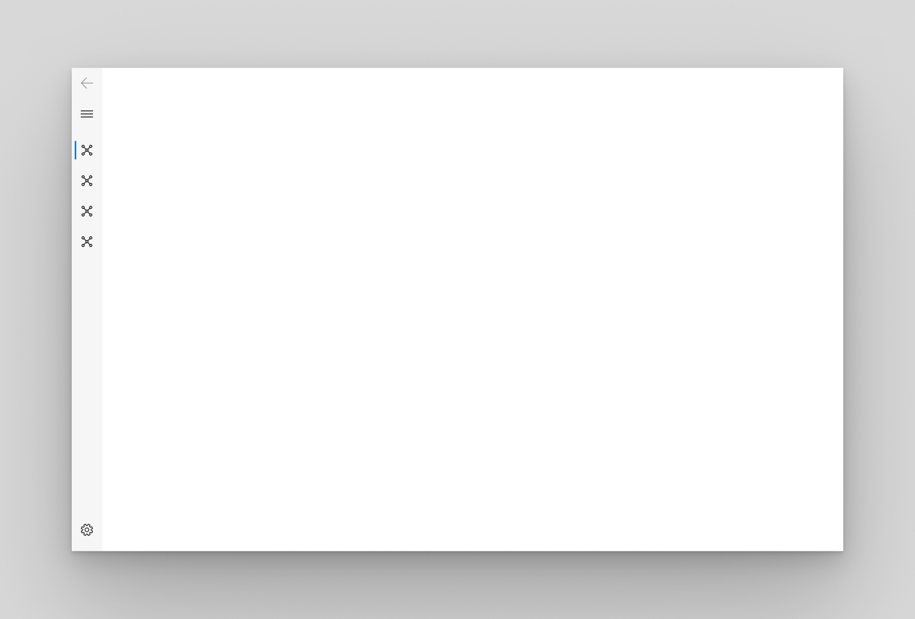 | The pane shows only icons until opened and is positioned to the left of the content. |
|
||
| Minimal |  | Only the menu button is shown until the pane is opened. When opened, it's positioned to the left of the content. |
|
||
| Auto | 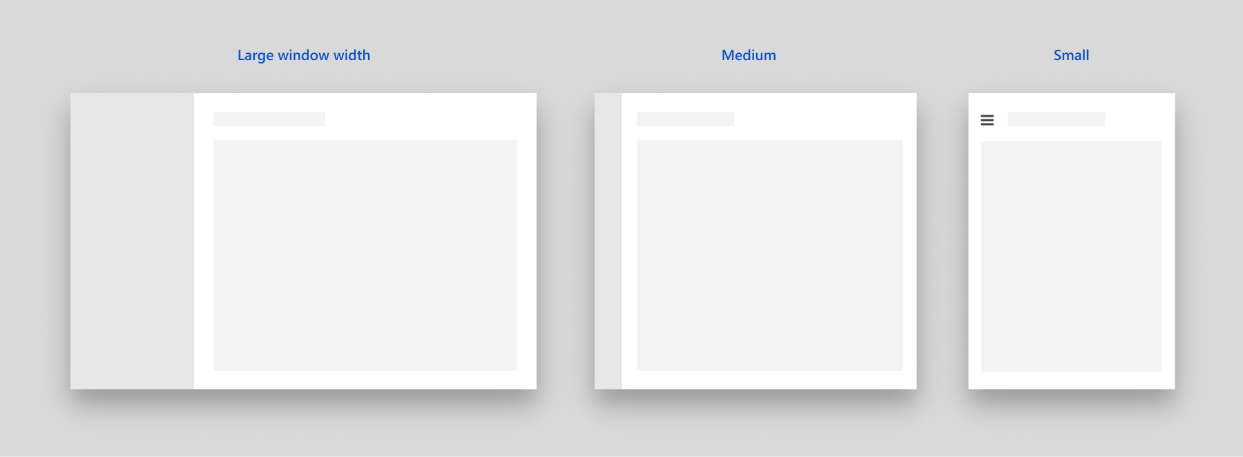 | By default, `displayMode` is set to `auto`. In Auto mode, the NavigationView adapts between `minimal` when the window is narrow, to `compact`, and then `open` as the window gets wider. |
|
||
|
||
You can customize the selected indicator. By default `StickyNavigationIndicator` is used, but you can also use the old windows indicator:
|
||
|
||
```dart
|
||
pane: NavigationPane(
|
||
indicator: const EndNavigationIndicator(),
|
||
)
|
||
```
|
||
|
||
### Navigation body
|
||
|
||
A navigation body is used to implement page transitions into a navigation view. It knows what is the current display mode of the parent `NavigationView`, if any, and define the page transitions accordingly.
|
||
|
||
For top mode, the horizontal page transition is used. For the others, drill in page transition is used.
|
||
|
||
You can also supply a builder function to create the pages instead of a list of widgets. For this use the `NavigationBody.builder` constructor.
|
||
|
||
```dart
|
||
int _currentIndex = 0;
|
||
|
||
NavigationView(
|
||
...,
|
||
content: NavigationBody(index: _currentIndex, children: [...]),
|
||
)
|
||
```
|
||
|
||
You can use `NavigationBody.builder`
|
||
|
||
```dart
|
||
NavigationView(
|
||
...,
|
||
content: NavigationBody.builder(
|
||
index: _currentIndex,
|
||
itemBuilder: (context, index) {
|
||
return ...;
|
||
}
|
||
)
|
||
)
|
||
```
|
||
|
||
`ScaffoldPage` is usually used with the navigation body as its children:
|
||
|
||
```dart
|
||
NavigationBody(
|
||
index: _currentIndex,
|
||
children: [
|
||
const ScaffoldPage(
|
||
topBar: PageHeader(header: Text('Your Songs'))
|
||
)
|
||
],
|
||
)
|
||
```
|
||
|
||
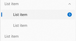
### Info Badge
|
||
|
||
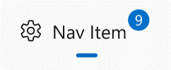
Badging is a non-intrusive and intuitive way to display notifications or bring focus to an area within an app - whether that be for notifications, indicating new content, or showing an alert. An `InfoBadge` is a small piece of UI that can be added into an app and customized to display a number, icon, or a simple dot. [Learn more](https://docs.microsoft.com/en-us/windows/apps/design/controls/info-badge)
|
||
|
||
|
||
|
||
InfoBadge is built into `NavigationView`, but can also be placed as a standalone widget, allowing you to place InfoBadge into any control or piece of UI of your choosing. When you use an `InfoBadge` somewhere other than `NavigationView`, you are responsible for programmatically determining when to show and dismiss the `InfoBadge`, and where to place the `InfoBadge`.
|
||
|
||
Here's an example of how to add an info badge to a `PaneItem`:
|
||
|
||
```dart
|
||
NavigationView(
|
||
...,
|
||
pane: NavigationPane(
|
||
...
|
||
children: [
|
||
PaneItem(
|
||
icon: Icon(FluentIcons.more),
|
||
title: const Text('Others'),
|
||
infoBadge: const InfoBadge(
|
||
source: Text('9'),
|
||
),
|
||
),
|
||
],
|
||
),
|
||
...
|
||
)
|
||
```
|
||
|
||
Which produces the folllowing effects in the display modes:
|
||
|
||
| Open | Compact | Top |
|
||
| ---- | ------- | --- |
|
||
|  |  |  |
|
||
|
||
## Tab View
|
||
|
||
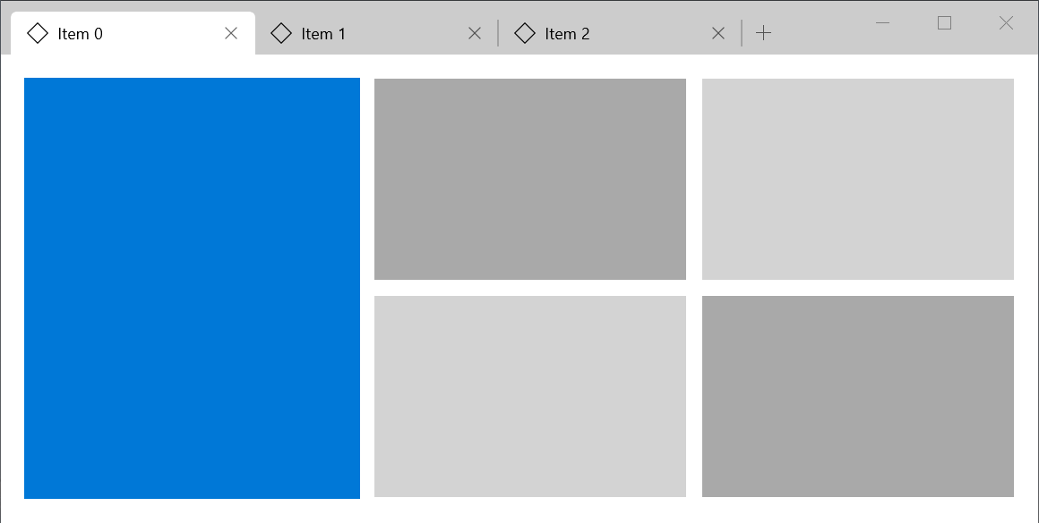
The TabView control is a way to display a set of tabs and their respective content. TabViews are useful for displaying several pages (or documents) of content while giving a user the capability to rearrange, open, or close new tabs. [Learn more](https://docs.microsoft.com/en-us/windows/uwp/design/controls-and-patterns/tab-view)
|
||
|
||
Here's an example of how to create a tab view:
|
||
|
||
```dart
|
||
SizedBox(
|
||
height: 600,
|
||
child: TabView(
|
||
currentIndex: currentIndex,
|
||
onChanged: (index) => setState(() => currentIndex = index),
|
||
onNewPressed: () {
|
||
setState(() => tabs++);
|
||
},
|
||
tabs: List.generate(tabs, (index) {
|
||
return Tab(
|
||
text: Text('Tab $index'),
|
||
closeIcon: FluentIcons.chrome_close,
|
||
);
|
||
}),
|
||
bodies: List.generate(
|
||
tabs,
|
||
(index) => Container(
|
||
color: index.isEven ? Colors.red : Colors.yellow,
|
||
),
|
||
),
|
||
),
|
||
),
|
||
```
|
||
|
||
The code above produces the following:
|
||
|
||
|
||
|
||
## Bottom Navigation
|
||
|
||
The bottom navigation displays icons and optional text at the bottom of the screen for switching between different primary destinations in an app. This is commomly used on small screens. [Learn more](https://developer.microsoft.com/pt-br/fluentui#/controls/android/bottomnavigation)
|
||
|
||
Here's an example of how to create a bottom navigation:
|
||
|
||
```dart
|
||
int index = 0;
|
||
|
||
ScaffoldPage(
|
||
content: NavigationBody(index: index, children: [
|
||
Container(),
|
||
Container(),
|
||
Container(),
|
||
]),
|
||
bottomBar: BottomNavigation(
|
||
index: index,
|
||
onChanged: (i) => setState(() => index = i),
|
||
items: [
|
||
BottomNavigationItem(
|
||
icon: Icon(Icons.two_k),
|
||
selectedIcon: Icon(Icons.two_k_plus),
|
||
title: Text('Both'),
|
||
),
|
||
BottomNavigationItem(
|
||
icon: Icon(Icons.phone_android_outlined),
|
||
selectedIcon: Icon(Icons.phone_android),
|
||
title: Text('Android'),
|
||
),
|
||
BottomNavigationItem(
|
||
icon: Icon(Icons.phone_iphone_outlined),
|
||
selectedIcon: Icon(Icons.phone_iphone),
|
||
title: Text('iOS'),
|
||
),
|
||
],
|
||
)
|
||
)
|
||
|
||
```
|
||
|
||
# Inputs
|
||
|
||
Inputs are widgets that reacts to user interection. On most of the inputs you can set `onPressed` or `onChanged` to `null` to disable it.
|
||
|
||
## Button
|
||
|
||
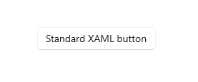
A button gives the user a way to trigger an immediate action. [Learn more](https://docs.microsoft.com/en-us/windows/apps/design/controls/buttons)
|
||
|
||
Here's an example of how to create a basic button:
|
||
|
||
```dart
|
||
Button(
|
||
child: Text('Standard XAML button'),
|
||
// Set onPressed to null to disable the button
|
||
onPressed: () {
|
||
print('button pressed');
|
||
}
|
||
)
|
||
```
|
||
|
||
The code above produces the following:
|
||
|
||
|
||
|
||
You can also use some alternative buttons:
|
||
|
||
### Filled Button
|
||
|
||
This button is identical to the `Button`, but with accent color fill in background
|
||
|
||
```dart
|
||
FilledButton(
|
||
child: Text('FILLED BUTTON'),
|
||
onPressed: () {
|
||
print('pressed filled button');
|
||
},
|
||
),
|
||
```
|
||
|
||
### Icon Button
|
||
|
||
This button is used to display an `Icon` as content. It's optmized to show icons.
|
||
|
||
```dart
|
||
IconButton(
|
||
icon: Icon(FluentIcons.add),
|
||
onPressed: () {
|
||
print('pressed icon button');
|
||
},
|
||
),
|
||
```
|
||
|
||
### Outlined Button
|
||
|
||
```dart
|
||
OutlinedButton(
|
||
child: Text('OUTLINED BUTTON'),
|
||
onPressed: () {
|
||
print('pressed outlined button');
|
||
},
|
||
),
|
||
```
|
||
|
||
### Text Button
|
||
|
||
```dart
|
||
TextButton(
|
||
child: Text('TEXT BUTTON'),
|
||
onPressed: () {
|
||
print('pressed text button');
|
||
},
|
||
),
|
||
```
|
||
|
||
## Split Button
|
||
|
||
A Split Button has two parts that can be invoked separately. One part behaves like a standard button and invokes an immediate action. The other part invokes a flyout that contains additional options that the user can choose from. [Learn more](https://docs.microsoft.com/en-us/windows/apps/design/controls/buttons#create-a-split-button)
|
||
|
||
You can use a `SplitButtonBar` to create a Split Button. It takes two `Button`s in the `buttons` property. You can also customize the button spacing by changing the property `interval` in its theme.
|
||
|
||
Here's an example of how to create a split button:
|
||
|
||
```dart
|
||
const double splitButtonHeight = 25.0;
|
||
|
||
SplitButtonBar(
|
||
style: SplitButtonThemeData(
|
||
interval: 1, // the default value is one
|
||
),
|
||
// There need to be at least 2 items in the buttons, and they must be non-null
|
||
buttons: [
|
||
SizedBox(
|
||
height: splitButtonHeight,
|
||
child: Button(
|
||
child: Container(
|
||
height: 24,
|
||
width: 24,
|
||
color: FluentTheme.of(context).accentColor,
|
||
),
|
||
onPressed: () {},
|
||
),
|
||
),
|
||
IconButton(
|
||
icon: const SizedBox(
|
||
height: splitButtonHeight,
|
||
child: const Icon(FluentIcons.chevron_down, size: 10.0),
|
||
),
|
||
onPressed: () {},
|
||
),
|
||
],
|
||
)
|
||
```
|
||
|
||
The code above produces the following button:
|
||
|
||
|
||
|
||
## Toggle Button
|
||
|
||
A button that can be on or off.
|
||
|
||
Here's an example of how to create a basic toggle button:
|
||
|
||
```dart
|
||
bool _value = false;
|
||
|
||
ToggleButton(
|
||
child: Text('Toggle Button'),
|
||
checked: _value,
|
||
onChanged: (value) => setState(() => _value = value),
|
||
)
|
||
```
|
||
|
||
## Checkbox
|
||
|
||
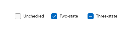
A check box is used to select or deselect action items. It can be used for a single item or for a list of multiple items that a user can choose from. The control has three selection states: unselected, selected, and indeterminate. Use the indeterminate state when a collection of sub-choices have both unselected and selected states. [Learn more](https://docs.microsoft.com/en-us/windows/uwp/design/controls-and-patterns/checkbox)
|
||
|
||
Here's an example of how to create a checkbox:
|
||
|
||
```dart
|
||
bool _checked = true;
|
||
|
||
Checkbox(
|
||
checked: _checked,
|
||
onChanged: (value) => setState(() => _checked = value),
|
||
)
|
||
```
|
||
|
||
#### Handling its states
|
||
|
||
| State | Property | Value |
|
||
| ------------- | --------- | -------- |
|
||
| checked | checked | `true` |
|
||
| unchecked | checked | `false` |
|
||
| indeterminate | checked | `null` |
|
||
| enabled | onChanged | non-null |
|
||
| disabled | onChanged | `null` |
|
||
|
||
|
||
|
||
## Toggle Switch
|
||
|
||
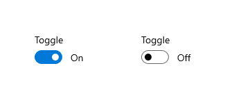
The toggle switch represents a physical switch that allows users to turn things on or off, like a light switch. Use toggle switch controls to present users with two mutually exclusive options (such as on/off), where choosing an option provides immediate results. [Learn more](https://docs.microsoft.com/en-us/windows/uwp/design/controls-and-patterns/toggles)
|
||
|
||
Here's an example of how to create a basic toggle switch:
|
||
|
||
```dart
|
||
bool _checked = false;
|
||
|
||
ToggleSwitch(
|
||
checked: _checked,
|
||
onChanged: (v) => setState(() => _checked = v),
|
||
content: Text(_checked ? 'On' : 'Off');
|
||
)
|
||
```
|
||
|
||
|
||
|
||
## Radio Buttons
|
||
|
||
Radio buttons, also called option buttons, let users select one option from a collection of two or more mutually exclusive, but related, options. Radio buttons are always used in groups, and each option is represented by one radio button in the group.
|
||
|
||
In the default state, no radio button in a RadioButtons group is selected. That is, all radio buttons are cleared. However, once a user has selected a radio button, the user can't deselect the button to restore the group to its initial cleared state.
|
||
|
||
The singular behavior of a RadioButtons group distinguishes it from check boxes, which support multi-selection and deselection, or clearing.
|
||
|
||
[Learn more](https://docs.microsoft.com/en-us/windows/uwp/design/controls-and-patterns/radio-button)
|
||
|
||
Here's an example of how to create a basic set of radio buttons:
|
||
|
||
```dart
|
||
int _currentIndex = -1;
|
||
|
||
final List<String> radioButtons = <String>[
|
||
'RadioButton 1',
|
||
'RadioButton 2',
|
||
'RadioButton 3',
|
||
];
|
||
|
||
Column(
|
||
children: List.generate(radioButtons.length, (index) {
|
||
return RadioButton(
|
||
checked: _currentIndex == index,
|
||
// set onChanged to null to disable the button
|
||
onChanged: (value) => setState(() => _currentIndex = index),
|
||
content: Text(radioButtons[index]),
|
||
);
|
||
}),
|
||
),
|
||
```
|
||
|
||
The code above produces the following:
|
||
|
||

|
||
|
||
## DropDown button
|
||
|
||
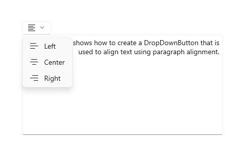
A DropDownButton is a button that shows a chevron as a visual indicator that it has an attached flyout that contains more options. [Learn more](https://docs.microsoft.com/en-us/windows/apps/design/controls/buttons#create-a-drop-down-button)
|
||
|
||
|
||
|
||
Here's an example of how to create a drop down button:
|
||
|
||
```dart
|
||
DropDownButton(
|
||
leading: const Icon(FluentIcons.align_left),
|
||
title: const Text('Alignment'),
|
||
items: [
|
||
DropDownButtonItem(
|
||
title: const Text('Left'),
|
||
leading: const Icon(FluentIcons.align_left),
|
||
onTap: () => debugPrint('left'),
|
||
),
|
||
DropDownButtonItem(
|
||
title: const Text('Center'),
|
||
leading: const Icon(FluentIcons.align_center),
|
||
onTap: () => debugPrint('center'),
|
||
),
|
||
DropDownButtonItem(
|
||
title: const Text('Right'),
|
||
leading: const Icon(FluentIcons.align_right),
|
||
onTap: () => debugPrint('right'),
|
||
),
|
||
],
|
||
);
|
||
```
|
||
|
||
## Slider
|
||
|
||
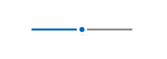
A slider is a control that lets the user select from a range of values by moving a thumb control along a track. [Learn more](https://docs.microsoft.com/en-us/windows/uwp/design/controls-and-patterns/slider)
|
||
|
||
A slider is a good choice when you know that users think of the value as a relative quantity, not a numeric value. For example, users think about setting their audio volume to low or medium—not about setting the value to 2 or 5.
|
||
|
||
Don't use a slider for binary settings. Use a [toggle switch](#toggle-switches) instead.
|
||
|
||
Here's an example of how to create a basic slider:
|
||
|
||
```dart
|
||
double _sliderValue = 0;
|
||
|
||
SizedBox(
|
||
// The default width is 200.
|
||
// The slider does not have its own widget, so you have to add it yourself.
|
||
// The slider always try to be as big as possible
|
||
width: 200,
|
||
child: Slider(
|
||
max: 100,
|
||
value: _sliderValue,
|
||
onChanged: (v) => setState(() => _sliderValue = v),
|
||
// Label is the text displayed above the slider when the user is interacting with it.
|
||
label: '${_sliderValue.toInt()}',
|
||
),
|
||
)
|
||
```
|
||
|
||
The code above produces the following:
|
||
|
||
|
||
|
||
### Choosing between vertical and horizontal sliders
|
||
|
||
You can set `vertical` to `true` to create a vertical slider
|
||
|
||
| Horizontal | Vertical |
|
||
| ----------------------------------------------------------------- | ---------------------------------------------------------------------------------------------------- |
|
||
| If the control is used to seek within media, like in a video app. | if the slider represents a real-world value that is normally shown vertically (such as temperature). |
|
||
|
||
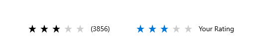
## Rating Bar
|
||
|
||
> The property `starSpacing` was not implemented yet
|
||
|
||
The rating control allows users to view and set ratings that reflect degrees of satisfaction with content and services. [Learn more](https://docs.microsoft.com/en-us/windows/uwp/design/controls-and-patterns/rating)
|
||
|
||
### Example
|
||
|
||
```dart
|
||
double rating = 0.0;
|
||
|
||
RatingBar(
|
||
rating: rating,
|
||
onChanged: (v) => setState(() => rating = v),
|
||
)
|
||
```
|
||
|
||
You can set `amount` to change the amount of stars. The `rating` must be less than the stars and more than 0. You can also change the `icon`, its size and color. You can make the bar read only by setting `onChanged` to `null`.
|
||
|
||
|
||
|
||
# Forms
|
||
|
||
A form is a group of controls that collect and submit data from users. Forms are typically used for settings pages, surveys, creating accounts, and much more.
|
||
|
||
## TextBox
|
||
|
||
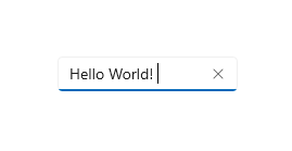
A Text Box lets a user type text into an app. It's typically used to capture a single line of text, but can be configured to capture multiple lines of text. The text displays on the screen in a simple, uniform, plaintext format. [Learn more](https://docs.microsoft.com/en-us/windows/apps/design/controls/text-box)
|
||
|
||
|
||
|
||
You can use the [Forms screen](example/lib/screens/forms.dart) in the example app for reference.
|
||
|
||
You can use the widget `TextBox` to create text boxes:
|
||
|
||
```dart
|
||
TextBox(
|
||
controller: ...,
|
||
header: 'Notes',
|
||
placeholder: 'Type your notes here',
|
||
),
|
||
```
|
||
|
||
Which produces the following:
|
||
|
||

|
||
|
||
If you want to validate the text box, use a `TextFormBox`:
|
||
|
||
```dart
|
||
TextFormBox(
|
||
placeholder: 'Your email',
|
||
validator: (text) {
|
||
if (text == null || text.isEmpty) return 'Provide an email';
|
||
}
|
||
),
|
||
```
|
||
|
||
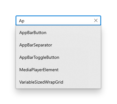
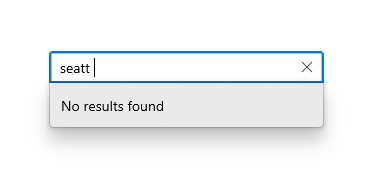
## Auto Suggest Box
|
||
|
||
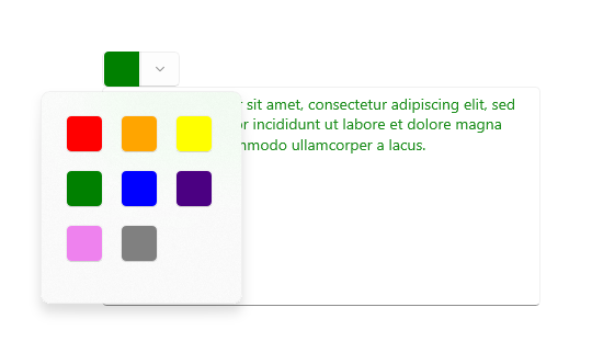
Use an AutoSuggestBox to provide a list of suggestions for a user to select from as they type. [Learn more](https://docs.microsoft.com/en-us/windows/uwp/design/controls-and-patterns/auto-suggest-box)
|
||
|
||
### Example
|
||
|
||
```dart
|
||
final autoSuggestBox = TextEditingController();
|
||
|
||
AutoSuggestBox<String>(
|
||
controller: autoSuggestBox,
|
||
items: [
|
||
'Blue',
|
||
'Green',
|
||
'Red',
|
||
'Yellow',
|
||
'Grey',
|
||
],
|
||
onSelected: (text) {
|
||
print(text);
|
||
},
|
||
textBoxBuilder: (context, controller, focusNode, key) {
|
||
const BorderSide _kDefaultRoundedBorderSide = BorderSide(
|
||
style: BorderStyle.solid,
|
||
width: 0.8,
|
||
);
|
||
return TextBox(
|
||
key: key,
|
||
controller: controller,
|
||
focusNode: focusNode,
|
||
suffixMode: OverlayVisibilityMode.editing,
|
||
suffix: IconButton(
|
||
icon: Icon(FluentIcons.close),
|
||
onPressed: () {
|
||
controller.clear();
|
||
focusNode.unfocus();
|
||
},
|
||
),
|
||
placeholder: 'Type a color',
|
||
);
|
||
},
|
||
)
|
||
```
|
||
|
||
The code above produces the following:
|
||
|
||
|
||
|
||
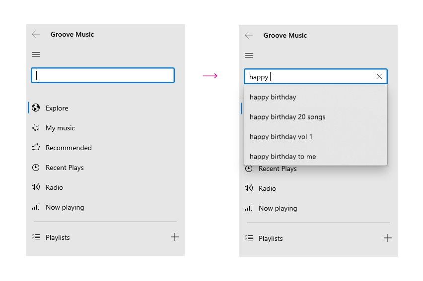
### Screenshots
|
||
|
||
|
||
|
||
|
||
## Combo Box
|
||
|
||
Use a combo box (also known as a drop-down list) to present a list of items that a user can select from. A combo box starts in a compact state and expands to show a list of selectable items. A ListBox is similar to a combo box, but is not collapsible/does not have a compact state. [Learn more](https://docs.microsoft.com/en-us/windows/apps/design/controls/combo-box)
|
||
|
||
Here's an example of how to create a basic combo box:
|
||
|
||
```dart
|
||
|
||
final values = ['Blue', 'Green', 'Yellow', 'Red'];
|
||
String? comboBoxValue;
|
||
|
||
SizedBox(
|
||
width: 200,
|
||
child: Combobox<String>(
|
||
placeholder: Text('Selected list item'),
|
||
isExpanded: true,
|
||
items: values
|
||
.map((e) => ComboboxItem<String>(
|
||
value: e,
|
||
child: Text(e),
|
||
))
|
||
.toList(),
|
||
value: comboBoxValue,
|
||
onChanged: (value) {
|
||
// print(value);
|
||
if (value != null) setState(() => comboBoxValue = value);
|
||
},
|
||
),
|
||
),
|
||
```
|
||
|
||
The code above produces the following:
|
||
|
||
|
||
|
||
# Widgets
|
||
|
||
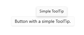
## Tooltip
|
||
|
||
A tooltip is a short description that is linked to another control or object. Tooltips help users understand unfamiliar objects that aren't described directly in the UI. They display automatically when the user moves focus to, presses and holds, or hovers the mouse pointer over a control. The tooltip disappears after a few seconds, or when the user moves the finger, pointer or keyboard/gamepad focus. [Learn more](https://docs.microsoft.com/en-us/windows/apps/design/controls/tooltips)
|
||
|
||
To add a tooltip to a widget, wrap it in a `Tooltip` widget:
|
||
|
||
```dart
|
||
Tooltip(
|
||
message: 'Click to perform an action',
|
||
child: Button(
|
||
child: Text('Button with tooltip'),
|
||
onPressed: () {
|
||
print('Pressed button with tooltip');
|
||
}
|
||
),
|
||
)
|
||
```
|
||
|
||
It's located above or below the `child` widget. You can specify the preffered location when both locations are available using the `preferBelow` property.
|
||
|
||
|
||
|
||
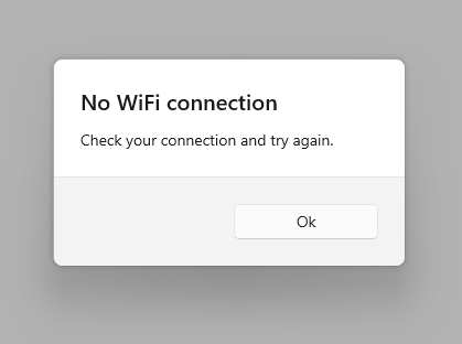
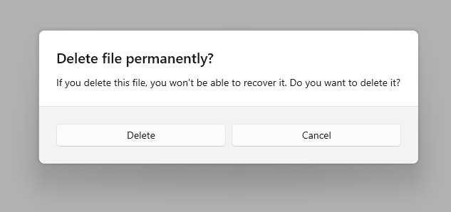
## Content Dialog
|
||
|
||
Dialogs are modal UI overlays that provide contextual app information. They block interactions with the app window until being explicitly dismissed. They often request some kind of action from the user. [Learn more](https://docs.microsoft.com/en-us/windows/uwp/design/controls-and-patterns/dialogs-and-flyouts/dialogs)
|
||
|
||
You can create a Dialog with the widget `ContentDialog`:
|
||
|
||
```dart
|
||
ContentDialog(
|
||
title: Text('No WiFi connection'),
|
||
content: Text('Check your connection and try again'),
|
||
actions: [
|
||
Button(
|
||
child: Text('Ok'),
|
||
onPressed: () {
|
||
Navigator.pop(context);
|
||
}
|
||
)
|
||
],
|
||
),
|
||
```
|
||
|
||
The code above produces the following:
|
||
|
||
|
||
|
||
You can display the dialog as an overlay by calling the function `showDialog`:
|
||
|
||
```dart
|
||
showDialog(
|
||
context: context,
|
||
builder: (context) {
|
||
return ContentDialog(...);
|
||
},
|
||
);
|
||
```
|
||
|
||
\
|
||
\
|
||
|
||
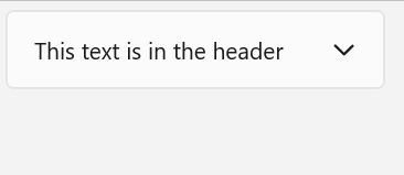
## Expander
|
||
|
||
Expander lets you show or hide less important content that's related to a piece of primary content that's always visible. Items contained in the `header` are always visible. The user can expand and collapse the `content` area, where secondary content is displayed, by interacting with the header. When the content area is expanded, it pushes other UI elements out of the way; it does not overlay other UI. The Expander can expand upwards or downwards.
|
||
|
||
Both the `header` and `content` areas can contain any content, from simple text to complex UI layouts. For example, you can use the control to show additional options for an item.
|
||
|
||
|
||
|
||
Use an Expander when some primary content should always be visible, but related secondary content may be hidden until needed. This UI is commonly used when display space is limited and when information or options can be grouped together. Hiding the secondary content until it's needed can also help to focus the user on the most important parts of your app.
|
||
|
||
Here's an example of how to create an expander:
|
||
|
||
```dart
|
||
Expander(
|
||
header: const Text('This thext is in header'),
|
||
content: const Text('This is the content'),
|
||
direction: ExpanderDirection.down, // (optional). Defaults to ExpanderDirection.down
|
||
initiallyExpanded: false, // (false). Defaults to false
|
||
),
|
||
```
|
||
|
||
Open and close the expander programatically:
|
||
|
||
```dart
|
||
final _expanderKey = GlobalKey<ExpanderState>();
|
||
|
||
Expander(
|
||
header: const Text('This thext is in header'),
|
||
content: const Text('This is the content'),
|
||
),
|
||
|
||
// Call this function to close the expander
|
||
void close() {
|
||
_expanderKey.currentState?.open = false;
|
||
}
|
||
```
|
||
|
||
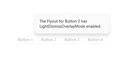
## Flyout
|
||
|
||
A flyout is a light dismiss container that can show arbitrary UI as its content. Flyouts can contain other flyouts or context menus to create a nested experience.
|
||
|
||
|
||
|
||
```dart
|
||
final flyoutController = FlyoutController();
|
||
|
||
Flyout(
|
||
controller: flyoutController,
|
||
content: const FlyoutContent(
|
||
constraints: BoxConstraints(maxWidth: 100),
|
||
child: Text('The Flyout for Button 3 has LightDismissOverlayMode enabled'),
|
||
),
|
||
child: Button(
|
||
child: Text('Button 3'),
|
||
onPressed: flyoutController.open,
|
||
),
|
||
);
|
||
|
||
@override
|
||
void dispose() {
|
||
// Dispose the controller to free up resources
|
||
flyoutController.dispose();
|
||
super.dispose();
|
||
}
|
||
```
|
||
|
||
## Acrylic
|
||
|
||
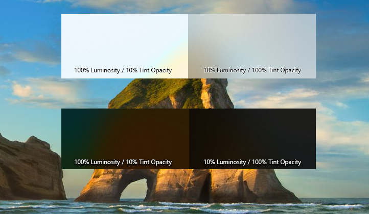
Acrylic is a type of Brush that creates a translucent texture. You can apply acrylic to app surfaces to add depth and help establish a visual hierarchy. [Learn more](https://docs.microsoft.com/en-us/windows/uwp/design/style/acrylic)
|
||
|
||

|
||
|
||
| Do | Don't |
|
||
| ----------------------------------------------------------------------------------------------------------------------------------- | --------------------------------------------------------------------------------------------------------------------------------------------------------- |
|
||
| Do use acrylic as the background material of non-primary app surfaces like navigation panes. | Don't put desktop acrylic on large background surfaces of your app - this breaks the mental model of acrylic being used primarily for transient surfaces. |
|
||
| Do extend acrylic to at least one edge of your app to provide a seamless experience by subtly blending with the app’s surroundings. | Don’t place in-app and background acrylics directly adjacent to avoid visual tension at the seams. |
|
||
| | Don't place multiple acrylic panes with the same tint and opacity next to each other because this results in an undesirable visible seam. |
|
||
| | Don’t place accent-colored text over acrylic surfaces. |
|
||
|
||
```dart
|
||
SizedBox(
|
||
height: ...,
|
||
width: ...,
|
||
child: Acrylic(
|
||
child: Button(
|
||
child: Text('Mom it\'s me hehe <3'),
|
||
onPressed: () {
|
||
print('button inside acrylic pressed');
|
||
}
|
||
),
|
||
),
|
||
),
|
||
```
|
||
|
||
|
||
|
||
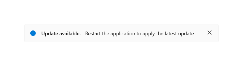
## InfoBar
|
||
|
||
The `InfoBar` control is for displaying app-wide status messages to users that are highly visible yet non-intrusive. There are built-in Severity levels to easily indicate the type of message shown as well as the option to include your own call to action or hyperlink button. Since the InfoBar is inline with other UI content the option is there for the control to always be visible or dismissed by the user.
|
||
|
||
You can easility create it using the `InfoBar` widget and theme it using `InfoBarThemeData`. It has built-in support for both light and dark theme:
|
||
|
||
```dart
|
||
bool _visible = true;
|
||
|
||
if (_visible)
|
||
InfoBar(
|
||
title: Text('Update available'),
|
||
content: Text('Restart the app to apply the latest update.'), // optional
|
||
severity: InfoBarSeverity.info, // optional. Default to InfoBarSeverity.info
|
||
onClose: () {
|
||
// Dismiss the info bar
|
||
setState(() => _visible = false);
|
||
}
|
||
),
|
||
```
|
||
|
||
Which produces the following:
|
||
|
||
|
||
|
||
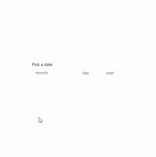
## Date Picker
|
||
|
||
The date picker gives you a standardized way to let users pick a localized date value using touch, mouse, or keyboard input. [Learn more](https://docs.microsoft.com/en-us/windows/apps/design/controls/date-picker)
|
||
|
||
The entry point displays the chosen date, and when the user selects the entry point, a picker surface expands vertically from the middle for the user to make a selection. The date picker overlays other UI; it doesn't push other UI out of the way.
|
||
|
||
We use [intl](https://pub.dev/packages/intl) to format the dates. You can [change the current locale](https://pub.dev/packages/intl#current-locale) to change formatting
|
||
|
||
Here's an example of how to create a basic date picker:
|
||
|
||
```dart
|
||
DateTime date = DateTime.now();
|
||
|
||
SizedBox(
|
||
width: 295,
|
||
child: DatePicker(
|
||
header: 'Date of birth',
|
||
selected: date,
|
||
onChanged: (v) => setState(() => date = v),
|
||
),
|
||
);
|
||
```
|
||
|
||
Which produces the following:
|
||
|
||
|
||
|
||
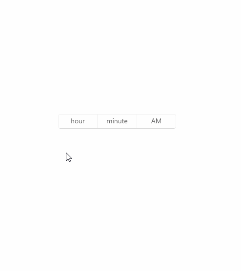
## Time Picker
|
||
|
||
The time picker gives you a standardized way to let users pick a time value using touch, mouse, or keyboard input. [Learn more](https://docs.microsoft.com/en-us/windows/apps/design/controls/time-picker)
|
||
|
||
Use a time picker to let a user pick a single time value.
|
||
|
||
Here's an example of how to create a basic time picker:
|
||
|
||
```dart
|
||
DateTime date = DateTime.now();
|
||
|
||
SizedBox(
|
||
width: 240,
|
||
child: TimePicker(
|
||
header: 'Arrival time',
|
||
selected: date,
|
||
onChanged: (v) => setState(() => date = v),
|
||
),
|
||
),
|
||
```
|
||
|
||
The code above produces the following:
|
||
|
||
|
||
|
||
## Progress Bar and Progress Ring
|
||
|
||
A progress control provides feedback to the user that a long-running operation is underway. It can mean that the user cannot interact with the app when the progress indicator is visible, and can also indicate how long the wait time might be, depending on the indicator used.
|
||
|
||
Here's an example of how to create a ProgressBar:
|
||
|
||
```dart
|
||
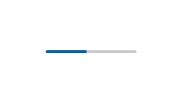
ProgressBar(value: 35)
|
||
```
|
||
|
||
|
||
|
||
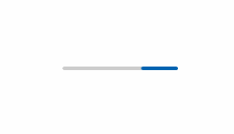
You can omit the `value` property to create an indeterminate progress bar:
|
||
|
||
|
||
|
||
Indeterminate Progress Bar is a courtesy of [@raitonubero](https://github.com/raitonoberu). Show him some love
|
||
|
||
Here's an example of how to create a progress ring:
|
||
|
||
```dart
|
||
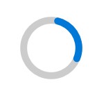
ProgressRing(value: 35)
|
||
```
|
||
|
||
|
||
|
||
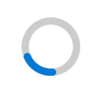
You can omit the `value` property to create an indeterminate progress ring:
|
||
|
||
|
||
|
||
Both Indeterminate ProgressBar and Indeterminate ProgressRing is a courtesy of [@raitonubero](https://github.com/raitonoberu). Show him some love ❤
|
||
|
||
## Scrollbar
|
||
|
||
A scrollbar thumb indicates which portion of a [ScrollView] is actually visible. [Learn more](https://docs.microsoft.com/en-us/windows/uwp/design/controls-and-patterns/scroll-controls)
|
||
|
||
Depending on the situation, the scrollbar uses two different visualizations, shown in the following illustration: the panning indicator (left) and the traditional scrollbar (right).
|
||
|
||
> Note that the arrows aren't visible. See [this](https://github.com/flutter/flutter/issues/80370) and [this](https://github.com/bdlukaa/fluent_ui/issues/14) issues for more info.
|
||
|
||

|
||

|
||
|
||
> When the scrollbar is visible it is overlaid as 16px on top of the content inside your ScrollView. In order to ensure good UX design you will want to ensure that no interactive content is obscured by this overlay. Additionally if you would prefer not to have UX overlap, leave 16px of padding on the edge of the viewport to allow for the scrollbar.
|
||
|
||
Here's an example of how to add a scrollbar to a ScrollView:
|
||
|
||
```dart
|
||
final _controller = ScrollController();
|
||
|
||
Scrollbar(
|
||
controller: _controller,
|
||
child: ListView.builder(
|
||
/// You can add a padding to the view to avoid having the scrollbar over the UI elements
|
||
padding: EdgeInsets.only(right: 16.0),
|
||
itemCount: 100,
|
||
itemBuilder: (context, index) {
|
||
return ListTile(title: Text('$index'));
|
||
}
|
||
),
|
||
)
|
||
```
|
||
|
||
Which produces the following:
|
||
|
||

|
||
|
||
You can change the `isAlwaysVisible` property to either enable or disable the fade effect. It's disabled by default.
|
||
|
||
## List Tile
|
||
|
||
You can use a `ListTile` in a `ListView`.
|
||
|
||
### Example
|
||
|
||
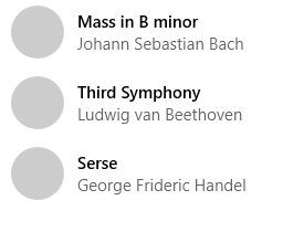
```dart
|
||
final people = {
|
||
'Mass in B minor': 'Johann Sebastian Bach',
|
||
'Third Symphony': 'Ludwig van Beethoven',
|
||
'Serse': 'George Frideric Hendel',
|
||
};
|
||
|
||
ListView.builder(
|
||
itemCount: people.length,
|
||
itemBuilder: (context, index) {
|
||
final title = people.keys.elementAt(index);
|
||
final subtitle = people[title];
|
||
return ListTile(
|
||
leading: CircleAvatar(),
|
||
title: Text(title),
|
||
subtitle: Text(subtitle!),
|
||
);
|
||
}
|
||
),
|
||
```
|
||
|
||
The code above produces the following:
|
||
|
||
|
||
|
||
If you want to create a tappable tile, use `TappableListTile` instead.
|
||
|
||
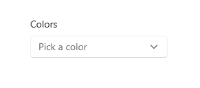
## Info Label
|
||
|
||
You can use an `InfoLabel` to tell the user the purpose of something.
|
||
|
||
Here's an example of how to add an info header to a combobox:
|
||
|
||
```dart
|
||
InfoLabel(
|
||
label: 'Colors',
|
||
child: ComboBox(...),
|
||
),
|
||
```
|
||
|
||
The code above produces the following:
|
||
|
||

|
||
|
||
Some widgets, such as `ComboBox` and `TextBox`, already come with a `header` property, so you can use them easily with them:
|
||
|
||
```dart
|
||
ComboBox(
|
||
header: 'Control header',
|
||
...
|
||
)
|
||
```
|
||
|
||
This will produce the same as the image above.
|
||
|
||
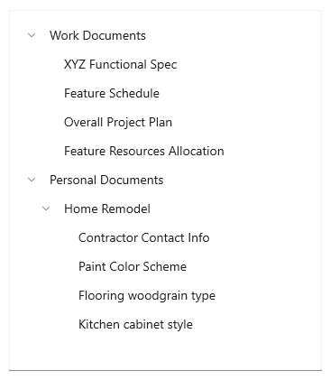
## TreeView
|
||
|
||
The `TreeView` control enables a hierarchical list with expanding and collapsing nodes that contain nested items. It can be used to illustrate a folder structure or nested relationships in your UI. [Learn More](https://docs.microsoft.com/en-us/windows/apps/design/controls/tree-view)
|
||
|
||
The tree view uses a combination of indentation and icons to represent the nested relationship between parent nodes and child nodes. Collapsed nodes use a chevron pointing to the right, and expanded nodes use a chevron pointing down.
|
||
|
||
|
||
|
||
You can include an icon in the tree view item data template to represent nodes. For example, if you show a file system hierarchy, you could use folder icons for the parent notes and file icons for the leaf nodes.
|
||
|
||
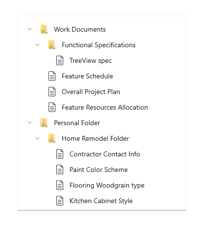
|
||
|
||
Each `TreeViewItem` can optionally take a `value` allowing you to store an arbitrary identifier with each item. This can be used in conjunction with `onSelectionChanged` to easily identify which items were selected without having to deconstruct the content widget.
|
||
|
||
Here's an example of how to create a tree view:
|
||
|
||
```dart
|
||
TreeView(
|
||
items: [
|
||
TreeViewItem(
|
||
content: const Text('Work Documents'),
|
||
children: [
|
||
TreeViewItem(content: const Text('XYZ Functional Spec')),
|
||
TreeViewItem(content: const Text('Feature Schedule')),
|
||
TreeViewItem(content: const Text('Overall Project Plan')),
|
||
TreeViewItem(content: const Text('Feature Resources Allocation')),
|
||
],
|
||
),
|
||
TreeViewItem(
|
||
content: const Text('Personal Documents'),
|
||
children: [
|
||
TreeViewItem(
|
||
content: const Text('Home Remodel'),
|
||
children: [
|
||
TreeViewItem(content: const Text('Contractor Contact Info')),
|
||
TreeViewItem(content: const Text('Paint Color Scheme')),
|
||
TreeViewItem(content: const Text('Flooring weedgrain type')),
|
||
TreeViewItem(content: const Text('Kitchen cabinet style')),
|
||
],
|
||
),
|
||
],
|
||
),
|
||
],
|
||
onItemInvoked: (item) => debugPrint(item), // (optional)
|
||
// (optional). Can be TreeViewSelectionMode.single or TreeViewSelectionMode.multiple
|
||
selectionMode: TreeViewSelectionMode.none,
|
||
),
|
||
```
|
||
|
||
### Scrollable tree view
|
||
|
||
Vertical scrolling can be enabled for a tree view by setting the `shrinkWrap` property to false.
|
||
If you have many items, consider setting `itemExtent`, `cacheExtent`, and/or `usePrototypeItem`
|
||
for much better performance.
|
||
|
||
### Lazily load nodes
|
||
|
||
Load nodes as required by the user
|
||
|
||
```dart
|
||
late List<TreeViewItem> items;
|
||
|
||
@override
|
||
void initState() {
|
||
super.initState();
|
||
items = [
|
||
TreeViewItem(
|
||
content: const Text('Parent node'),
|
||
children: [], // REQUIRED. An initial list of children must be provided. It must be mutable
|
||
onInvoked: (item) async {
|
||
// If the node is already populated, return
|
||
if (item.children.isNotEmpty) return;
|
||
setState(() => item.loading = true);
|
||
// Fetch more nodes from an async source, such as an API or device storage
|
||
final List<TreeViewItem> nodes = await fetchNodes();
|
||
setState(() {
|
||
item.loading = false;
|
||
item.children.addAll(nodes);
|
||
});
|
||
}
|
||
)
|
||
];
|
||
}
|
||
|
||
TreeView(
|
||
items: items,
|
||
);
|
||
```
|
||
|
||
## CommandBar
|
||
|
||
A `CommandBar` control provides quick access to common tasks. This could be application-level or page-level commands. [Learn More](https://docs.microsoft.com/en-us/windows/apps/design/controls/command-bar)
|
||
|
||
|
||
|
||
The `CommandBar` is composed of a number of `CommandBarItem` objects, which could be `CommandBarButton`, a `CommandBarSeparator`, or any custom object (e.g., a "split button" object). Sub-class `CommandBarItem` to create your own custom items.
|
||
|
||
Each `CommandBarItem` widget knows how to render itself in three different modes:
|
||
- `CommandBarItemDisplayMode.inPrimary`: Displayed horizontally in primary area
|
||
- `CommandBarItemDisplayMode.inPrimaryCompact`: More compact horizontal display (e.g., only the icon is displayed for `CommandBarButton`)
|
||
- `CommandBarItemDisplayMode.inSecondary`: Displayed within flyout menu `ListView`
|
||
|
||
The "primary area" of the command bar displays items horizontally. The "secondary area" of the command bar is a flyout menu accessed via an "overflow widget" (by default, a "more" button). You can specify items that should be displayed for each area. The overflow widget will only be displayed if there are items in the secondary area (including any items that dynamically overflowed into the secondary area, if dynamic overflow is enabled).
|
||
|
||
Whether or not the "compact" mode is selected for items displayed in the primary area is determined by an optional width breakpoint. If set, if the width of the widget is less than the breakpoint, it will render each primary `CommandBarItem` using the compact mode.
|
||
|
||
Different behaviors can be selected when the width of the `CommandBarItem` widgets exceeds the constraints, as determined by the specified `CommandBarOverflowBehavior`, including dynamic overflow (putting primary items into the secondary area on overflow), wrapping, clipping, scrolling, and no wrapping (will overflow).
|
||
|
||
The horizontal and vertical alignment can also be customized via the `mainAxisAlignment` and `crossAxisAlignment` properties. The main axis alignment respects current directionality.
|
||
|
||
A `CommandBarCard` can be used to create a raised card around a `CommandBar`. While this is not officially part of the Fluent design language, the concept is commonly used in the Office desktop apps for the app-level command bar.
|
||
|
||
Here is an example of a right-aligned command bar that has additional items in the secondary area:
|
||
|
||
```dart
|
||
CommandBar(
|
||
mainAxisAlignment: MainAxisAlignment.end,
|
||
overflowBehavior: CommandBarOverflowBehavior.dynamicOverflow,
|
||
compactBreakpointWidth: 768,
|
||
primaryItems: [
|
||
CommandBarButton(
|
||
icon: const Icon(FluentIcons.add),
|
||
label: const Text('Add'),
|
||
onPressed: () {},
|
||
),
|
||
CommandBarButton(
|
||
icon: const Icon(FluentIcons.edit),
|
||
label: const Text('Edit'),
|
||
onPressed: () {},
|
||
),
|
||
CommandBarButton(
|
||
icon: const Icon(FluentIcons.delete),
|
||
label: const Text('Edit'),
|
||
onPressed: () {},
|
||
),
|
||
],
|
||
secondaryItems: [
|
||
CommandBarButton(
|
||
icon: const Icon(FluentIcons.archive),
|
||
label: const Text('Archive'),
|
||
onPressed: () {},
|
||
),
|
||
CommandBarButton(
|
||
icon: const Icon(FluentIcons.move),
|
||
label: const Text('Move'),
|
||
onPressed: () {},
|
||
),
|
||
],
|
||
),
|
||
```
|
||
|
||
To put a tooltip on any other kind of `CommandBarItem` (or otherwise wrap it in another widget), use `CommandBarBuilderItem`:
|
||
|
||
```dart
|
||
CommandBarBuilderItem(
|
||
builder: (context, mode, w) => Tooltip(
|
||
message: "Create something new!",
|
||
child: w,
|
||
),
|
||
wrappedItem: CommandBarButton(
|
||
icon: const Icon(FluentIcons.add),
|
||
label: const Text('Add'),
|
||
onPressed: () {},
|
||
),
|
||
),
|
||
```
|
||
|
||
More complex examples, including command bars with items that align to each side of a carded bar, are in the example app.
|
||
|
||
# Mobile Widgets
|
||
|
||
Widgets with focus on mobile. Based on the official documentation and source code for [iOS](https://developer.microsoft.com/pt-br/fluentui#/controls/ios) and [Android](https://developer.microsoft.com/pt-br/fluentui#/controls/android). Most of the widgets above can adapt to small screens, and will fit on all your devices.
|
||
|
||
## Bottom Sheet
|
||
|
||
Bottom Sheet is used to display a modal list of menu items. They slide up over the main app content as a result of a user triggered action. [Learn more](https://developer.microsoft.com/pt-br/fluentui#/controls/android/bottomsheet)
|
||
|
||
Here's an example of how to display a bottom sheet:
|
||
|
||
```dart
|
||
showBottomSheet(
|
||
context: context,
|
||
builder: (context) {
|
||
return BottomSheet(
|
||
// header: ...,
|
||
description: Text('Description or Details here'),
|
||
children: [
|
||
...,
|
||
// Usually a `ListTile` or `TappableListTile`
|
||
],
|
||
);
|
||
},
|
||
),
|
||
```
|
||
|
||
To close it, just call `Navigator.of(context).pop()`
|
||
|
||
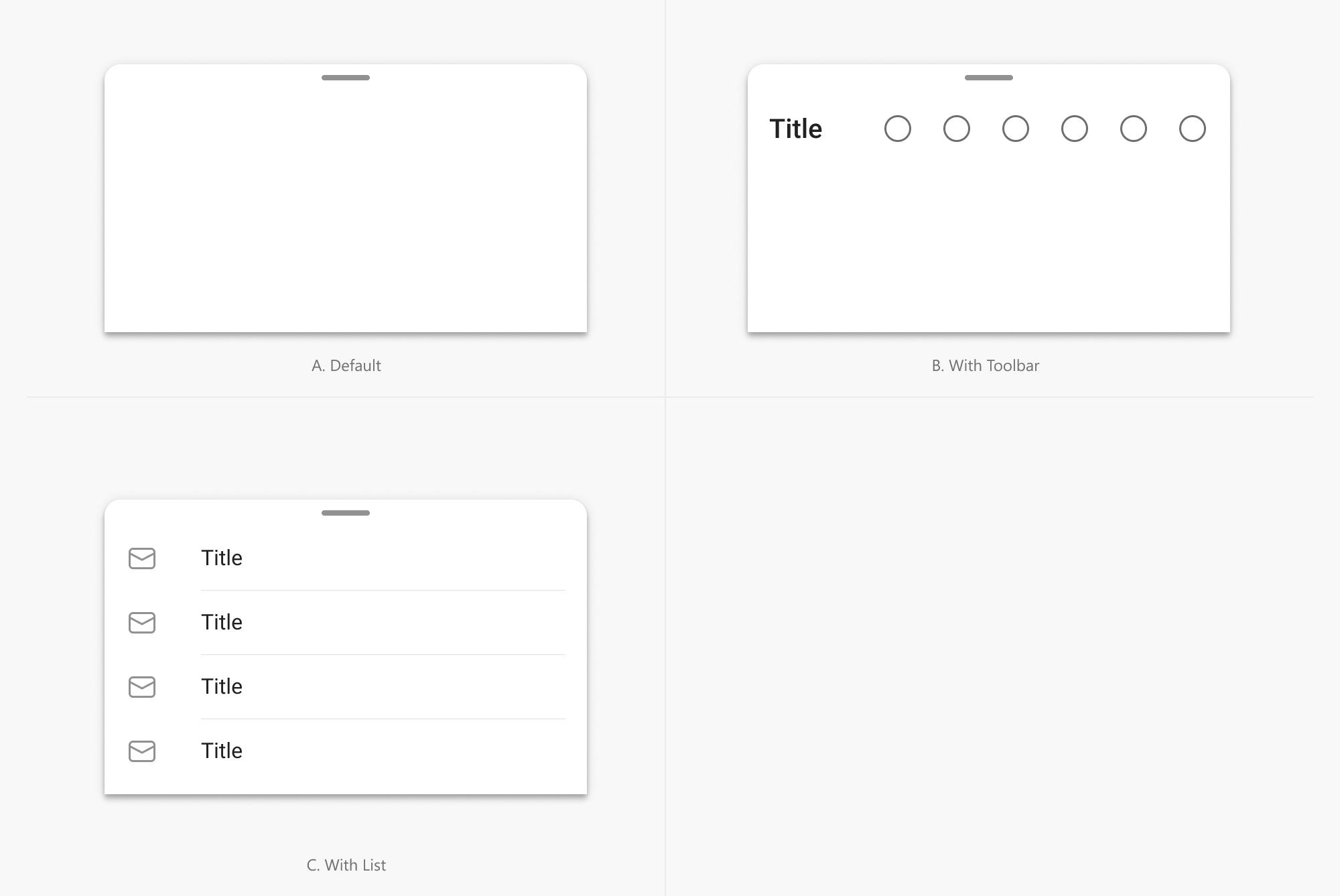
|
||
|
||
## Chip
|
||
|
||
Chips are compact representations of entities (most commonly, people) that can be clicked, deleted, or dragged easily.
|
||
|
||
Here's an example of how to create a chip:
|
||
|
||
```dart
|
||
Chip(
|
||
image: CircleAvatar(size: 12.0),
|
||
text: Text('Chip'),
|
||
),
|
||
Chip.selected(
|
||
image: FlutterLogo(size: 14.0),
|
||
text: Text('Chip'),
|
||
)
|
||
```
|
||
|
||

|
||
|
||

|
||
|
||
## Pill Button Bar
|
||
|
||
A Pill Button Bar is a horizontal scrollable list of pill-shaped text buttons in which only one button can be selected at a given time.
|
||
|
||
Here's an example of how to create a pill button bar:
|
||
|
||
```dart
|
||
int index = 0;
|
||
|
||
PillButtonBar(
|
||
selected: index,
|
||
onChanged: (i) => setState(() => index = i),
|
||
items: [
|
||
PillButtonBarItem(text: Text('All')),
|
||
PillButtonBarItem(text: Text('Mail')),
|
||
PillButtonBarItem(text: Text('Peopl')),
|
||
PillButtonBarItem(text: Text('Events')),
|
||
]
|
||
)
|
||
```
|
||
|
||
|
||
|
||

|
||
|
||
## Snackbar
|
||
|
||
Snackbars provide a brief message about an operation at the bottom of the screen. They can contain a custom action or view or use a style geared towards making special announcements to your users.
|
||
|
||
Here's an example of how to display a snackbar at the bottom of the screen:
|
||
|
||
```dart
|
||
showSnackbar(
|
||
context,
|
||
Snackbar(
|
||
content: Text('A new update is available!'),
|
||
),
|
||
);
|
||
```
|
||
|
||
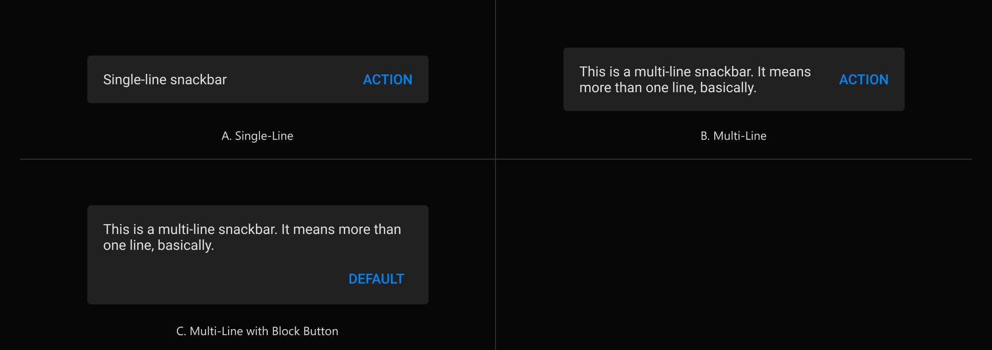
|
||
|
||
---
|
||
|
||
# Layout Widgets
|
||
|
||
Widgets that help to layout other widgets.
|
||
|
||
## DynamicOverflow
|
||
|
||
`DynamicOverflow` widget is similar to the `Wrap` widget, but only lays out children widgets in a single run, and if there is not room to display them all, it will hide widgets that don't fit, and display the "overflow widget" at the end. Optionally, the "overflow widget" can be displayed all the time. Displaying the overflow widget will take precedence over any children widgets.
|
||
|
||
This is used to implement the dynamic overflow mode for `CommandBar`, but could be useful on its own. It supports both horizontal and vertical layout modes, and various main axis and cross axis alignments.
|
||
|
||
# Equivalents with the material library
|
||
|
||
The list of equivalents between this library and `flutter/material.dart`
|
||
|
||
| Material | Fluent |
|
||
| ------------------------- | ---------------- |
|
||
| TextButton | Button |
|
||
| IconButton | IconButton |
|
||
| Checkbox | Checkbox |
|
||
| RadioButton | RadioButton |
|
||
| - | RatingBar |
|
||
| - | SplitButton |
|
||
| - | ToggleButton |
|
||
| Switch | ToggleSwitch |
|
||
| TextField | TextBox |
|
||
| TextFormField | TextFormBox |
|
||
| DropdownButton | Combobox |
|
||
| PopupMenuButton | DropDownButton |
|
||
| - | AutoSuggestBox |
|
||
| AlertDialog | ContentDialog |
|
||
| MaterialBanner | InfoBar |
|
||
| Tooltip | Tooltip |
|
||
| - | Flyout |
|
||
| Drawer | NavigationPane |
|
||
| BottomNavigation | BottomNavigation |
|
||
| Divider | Divider |
|
||
| VerticalDivider | Divider |
|
||
| Material | Acrylic |
|
||
| ListTile | ListTile |
|
||
| CheckboxListTile | CheckboxListTile |
|
||
| SwitchListTile | SwitchListTile |
|
||
| LinearProgressIndicator | ProgressBar |
|
||
| CircularProgressIndicator | ProgressRing |
|
||
| \_DatePickerDialog | DatePicker |
|
||
| \_TimePickerDialog | TimePicker |
|
||
| Scaffold | ScaffoldPage |
|
||
| AppBar | NavigationAppBar |
|
||
| Drawer | NavigationView |
|
||
| Chip | Chip |
|
||
| Snackbar | Snackbar |
|
||
| - | PillButtonBar |
|
||
| ExpansionPanel | Expander |
|
||
|
||
## Localization
|
||
|
||
FluentUI widgets currently supports out-of-the-box an wide number of languages, including:
|
||
|
||
- Arabic
|
||
- English
|
||
- French
|
||
- German
|
||
- Hindi
|
||
- Portuguese
|
||
- Russian
|
||
- Simplified Chinese
|
||
- Spanish
|
||
|
||
## Contribution
|
||
|
||
Feel free to [file an issue](https://github.com/bdlukaa/fluent_ui/issues/new) if you find a problem or [make pull requests](https://github.com/bdlukaa/fluent_ui/pulls).
|
||
|
||
All contributions are welcome :)
|
||
|
||
### Contributing new localizations
|
||
|
||
In [PR#216](https://github.com/bdlukaa/fluent_ui/pull/216) we added support for new localizations in FluentUI Widgets.
|
||
|
||
If you want to contribute adding new localizations please follow this steps:
|
||
|
||
- [Fork the repo](https://github.com/bdlukaa/fluent_ui/fork)
|
||
- Copy `lib/l10n/intl_en.arb` file into `lib/l10n` folder with a new language code, following [this list of ISO 859-1 codes](https://en.wikipedia.org/wiki/List_of_ISO_639-1_codes)
|
||
- Update the contents in the newly created file. Specially, please update the `@locale` value with the corresponding ISO code.
|
||
- Then update the `localization.dart:defaultSupportedLocales` list, adding an entry for each new locale
|
||
- If your IDE doesn't have any of the `intl` plugins ([Intl plugin for Android Studio/IntelliJ](https://plugins.jetbrains.com/plugin/13666-flutter-intl) / [Flutter Intl for VSCode](https://marketplace.visualstudio.com/items?itemName=localizely.flutter-intl) ) please run your project and code generation will take place.
|
||
- When you're done, [make a new pull request](https://github.com/bdlukaa/fluent_ui/pulls)
|
||
|
||
More about [Localization in the Flutter Official Documentation](https://docs.flutter.dev/development/accessibility-and-localization/internationalization)
|
||
|
||
### Acknowledgements
|
||
|
||
Irrespective of order, thanks to all the people below for contributing with the project. It means a lot to me :)
|
||
|
||
- [@HrX03](https://github.com/HrX03) for the `Acrylic`, `FluentIcons` generator and `_FluentTextSelectionControls` implementation.
|
||
- [@raitonubero](https://github.com/raitonoberu) `ProgressBar` and `ProgressRing` implementation
|
||
- [@alexmercerind](https://github.com/alexmercerind) for the [flutter_acrylic](https://github.com/alexmercerind/flutter_acrylic) plugin, used on the example app
|
||
- [@leanflutter](https://github.com/leanflutter) for the [window_manager](https://github.com/leanflutter/window_manager) plugin, used on the example app.
|
||
- [@henry2man](https://github.com/henry2man) for the [localization support](https://github.com/bdlukaa/fluent_ui/pull/216)
|
||
- [@klondikedragon](https://github.com/klondikedragon) for [`CommandBar` implementation](https://github.com/bdlukaa/fluent_ui/pull/232)
|